Heyllo! I'm editorial and type designer - Brussels based - using design as tool of negotiating cultural, artistic & societal matters. My practice defines itself as a space where design runs parallel with the narrative in which my projects grow.
I fuel this process with a systematic approach based on typography, grid systems & minimalism aesthetics - focusing on both digital & print which offer a wide spectrum of solutions suchlike identities, web interfaces, type design, printed objects or signage.
Alongside this practice, I am involved in Bye Bye Binary - a collective / alliance / atelier / community / network via which I actively work on designing inclusive & non-binary fonts to give writing a full range of queer alternatives & solutions.
For questions or collaborations, get in touch with me at hello[at]quentinlamouroux.com.
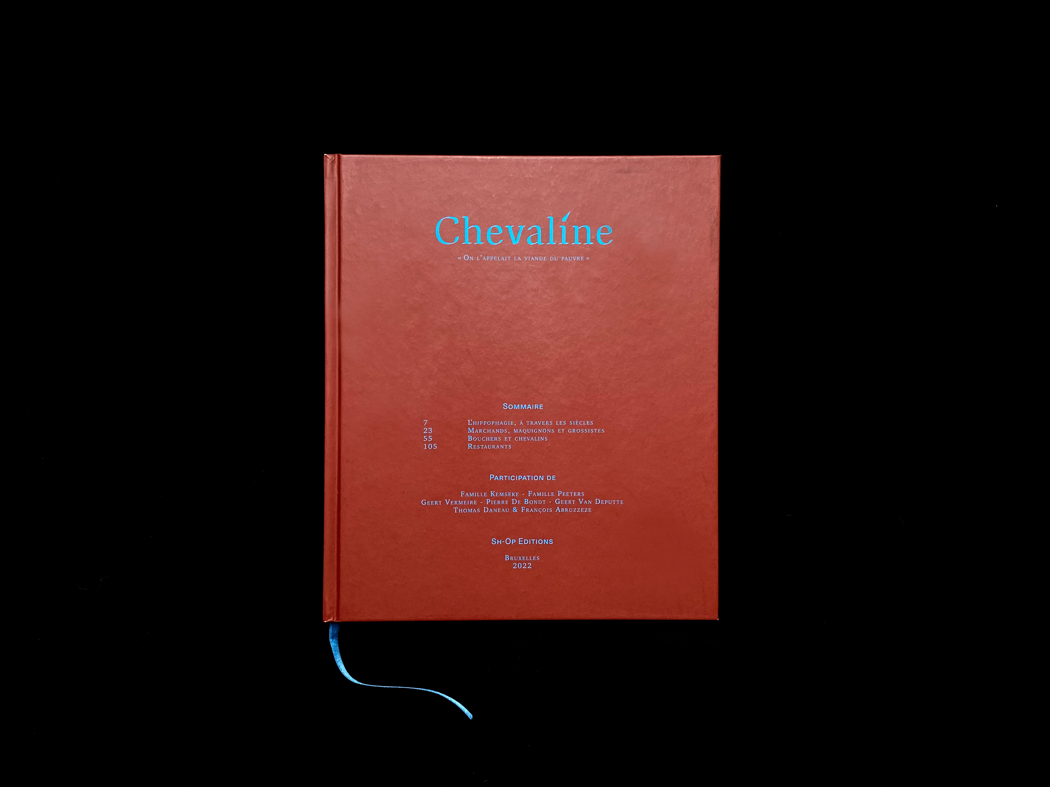 |
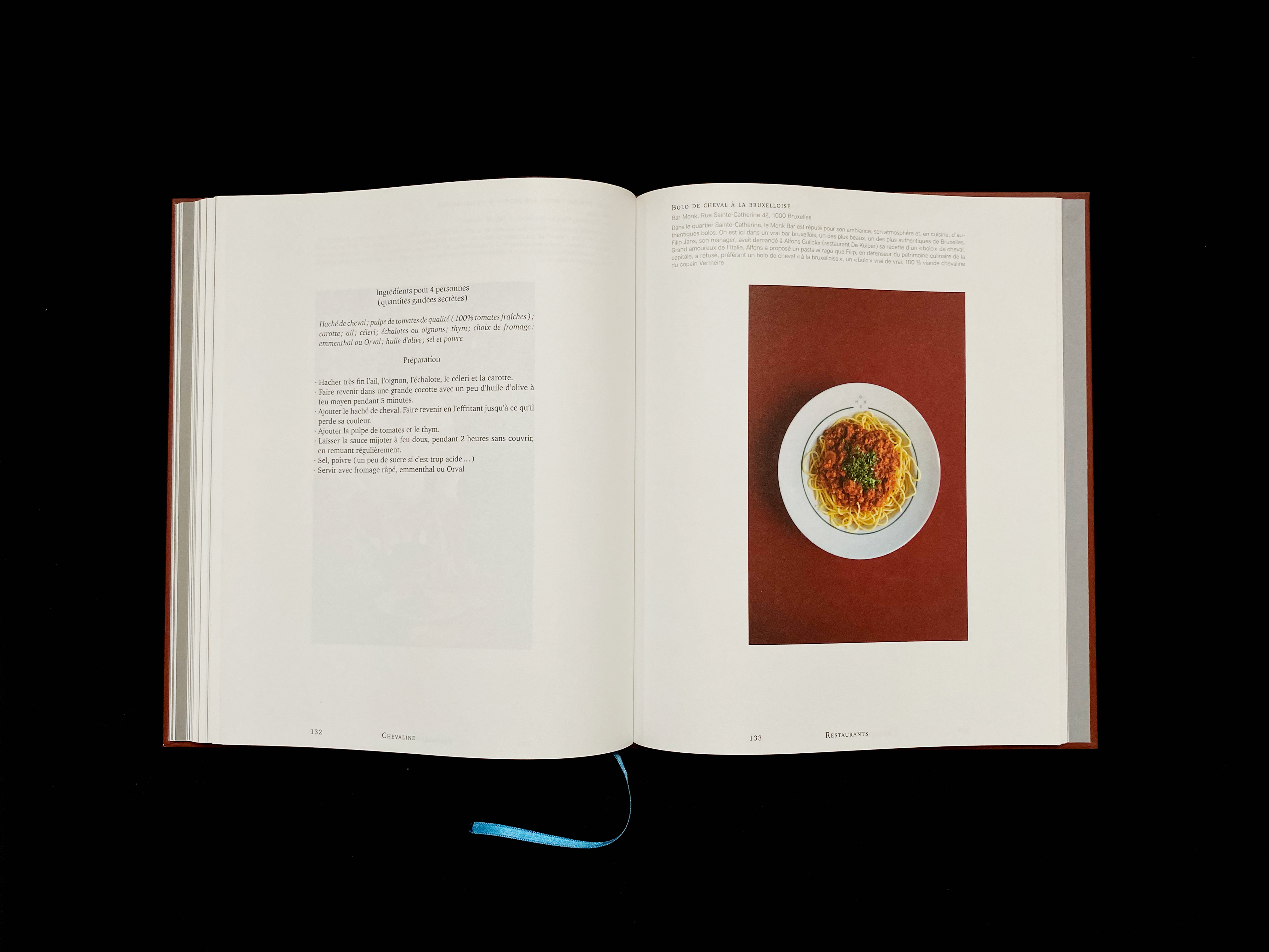
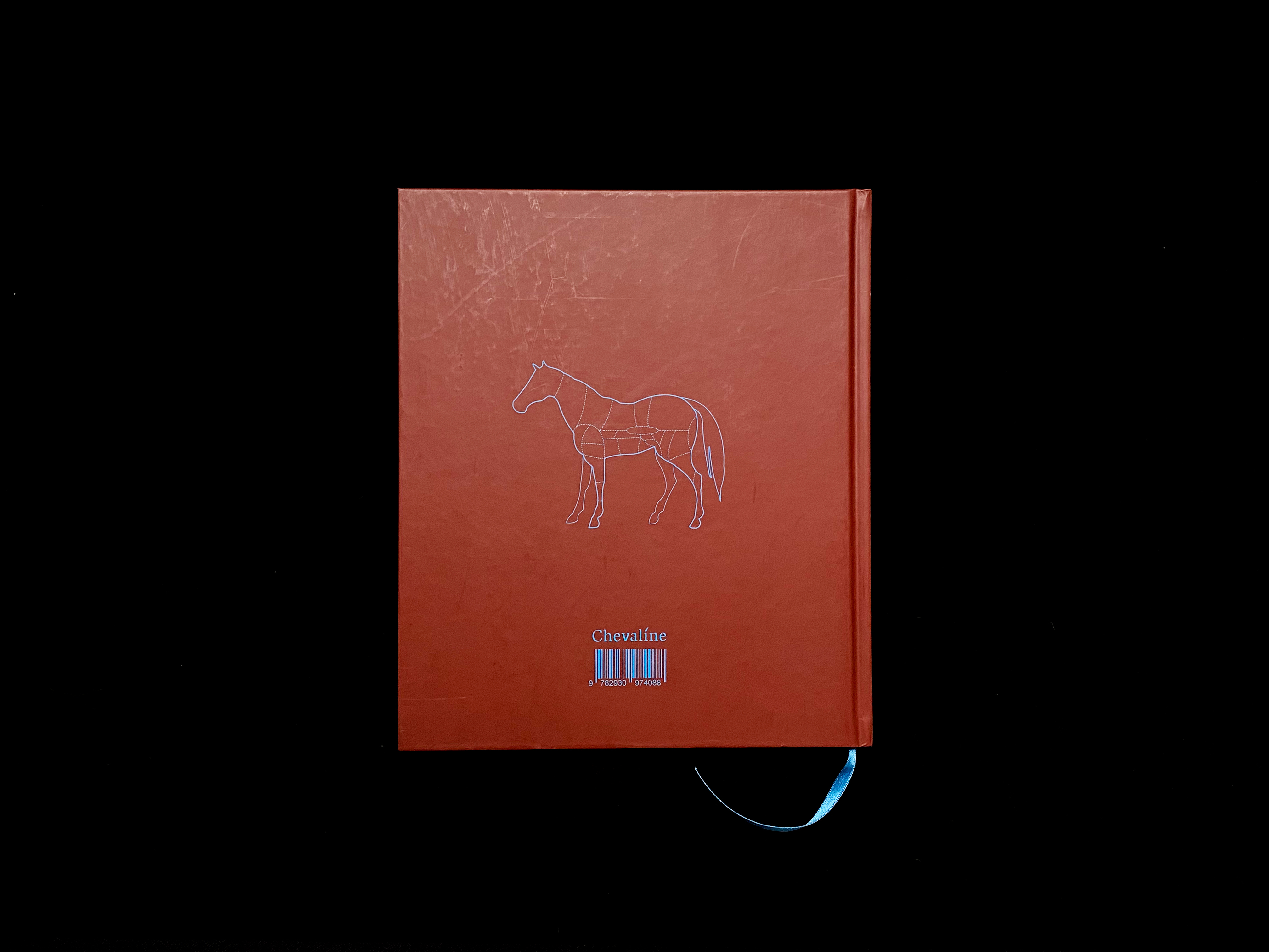
08 — Chevaline | Editorial |
|---|
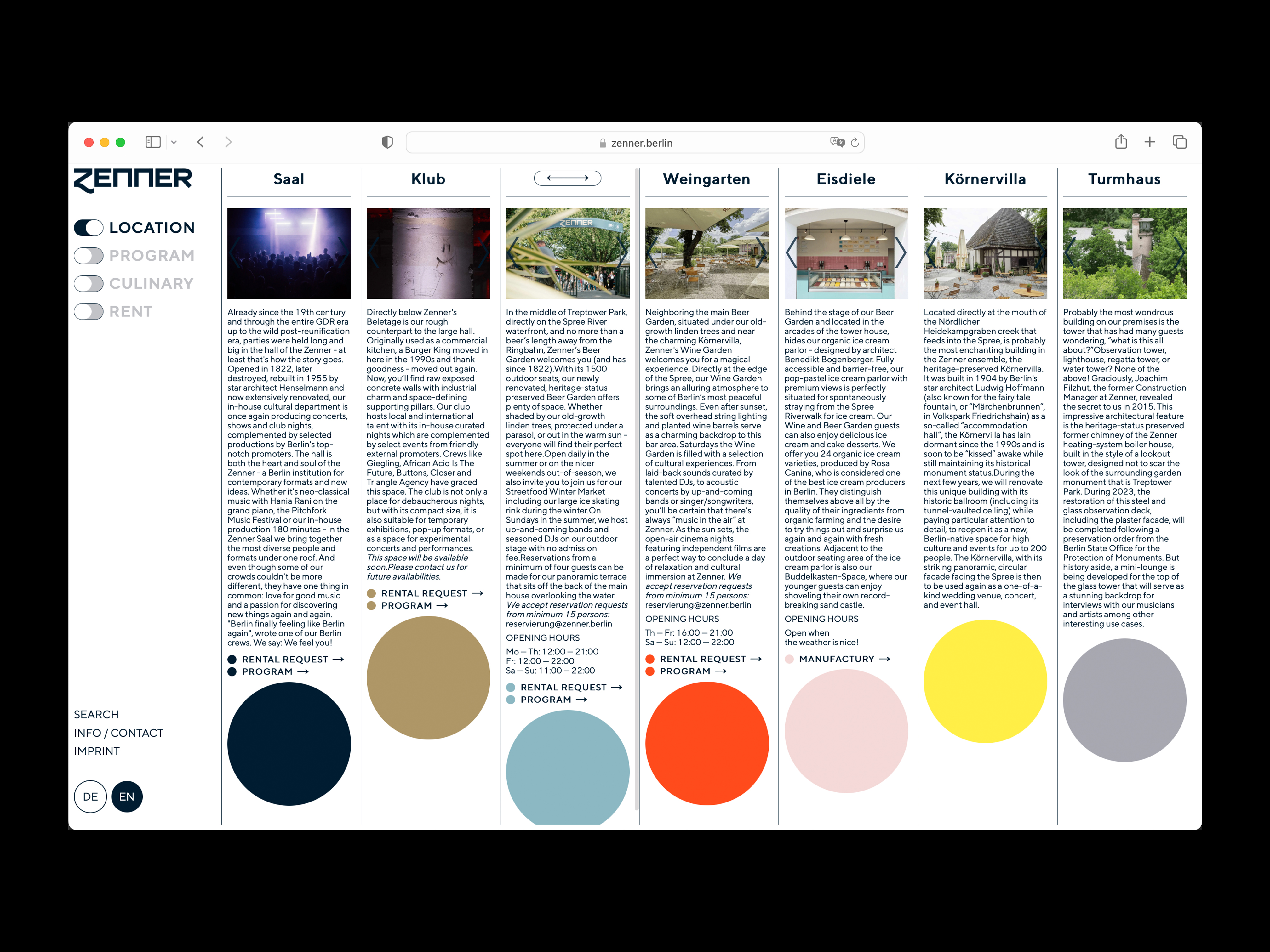 |
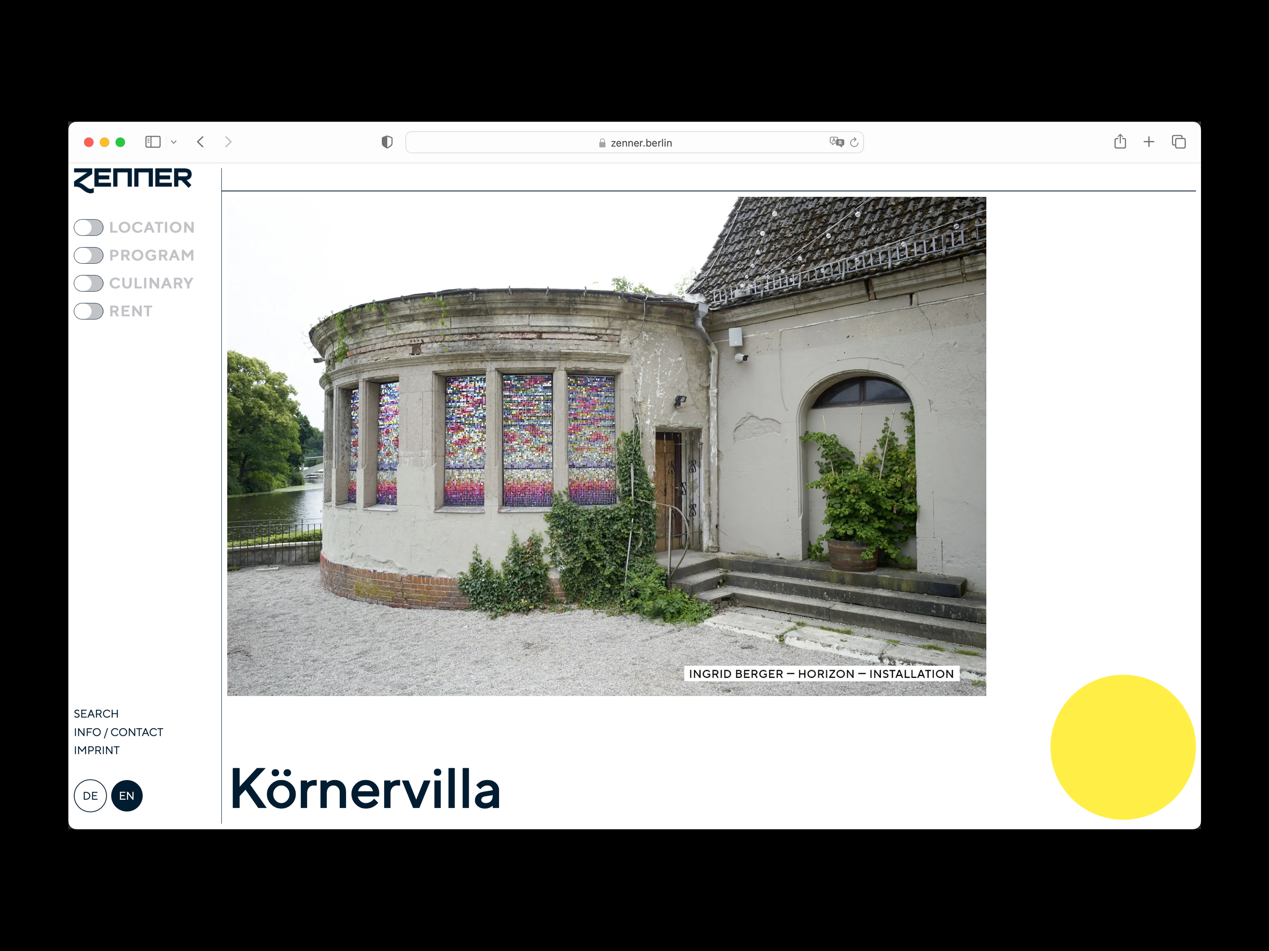
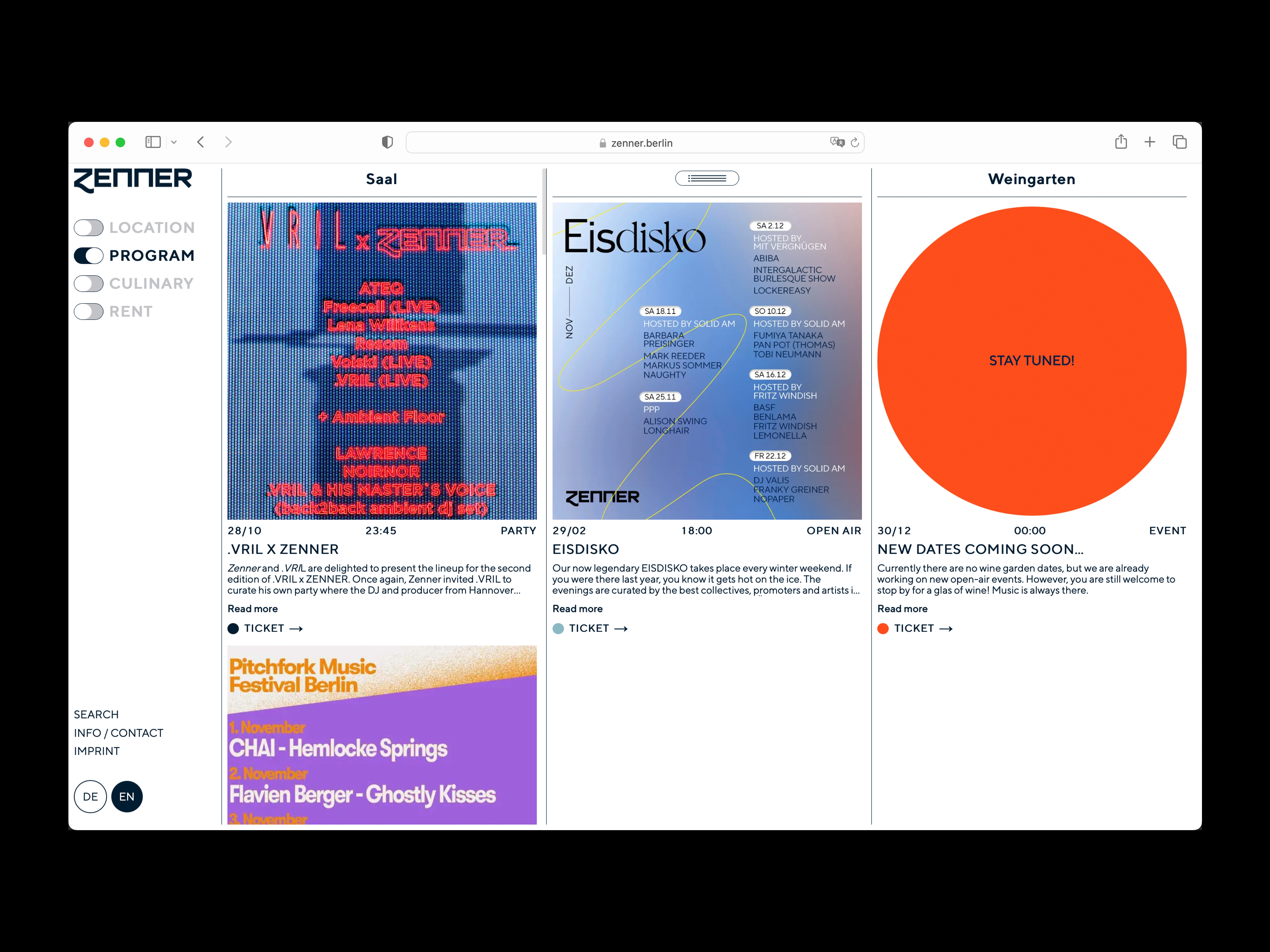
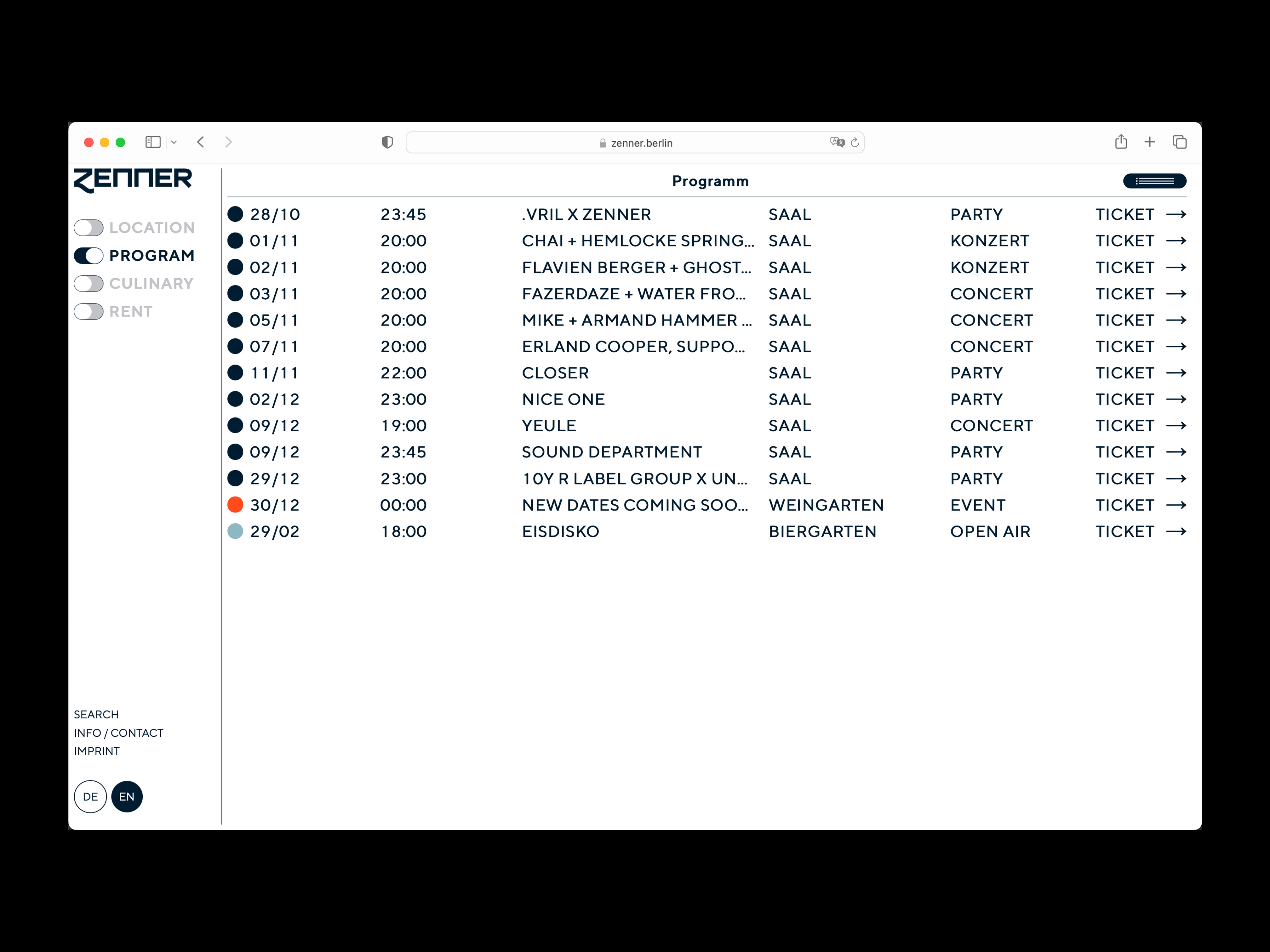
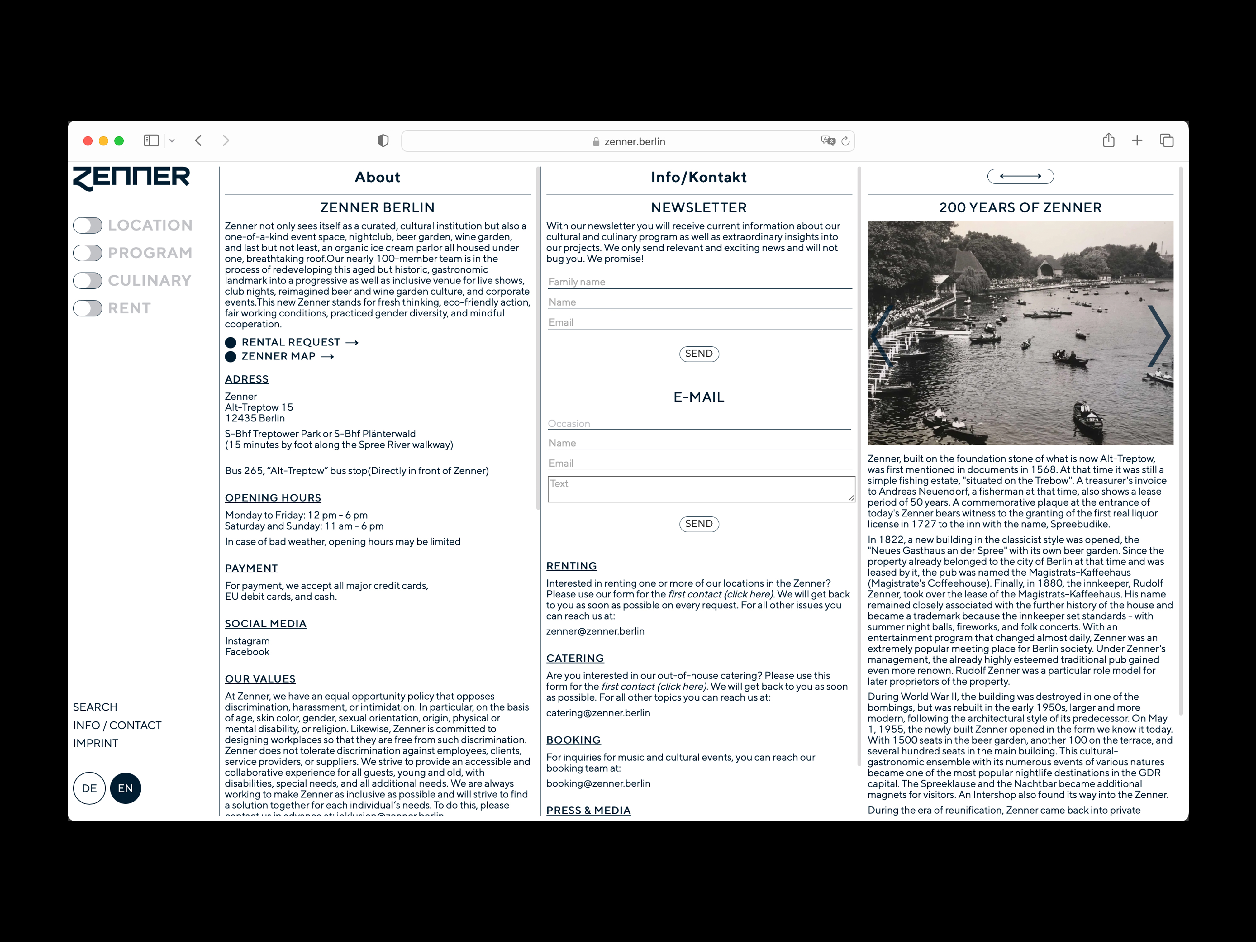
07 — Zenner Berlin | UX & UI |
|---|
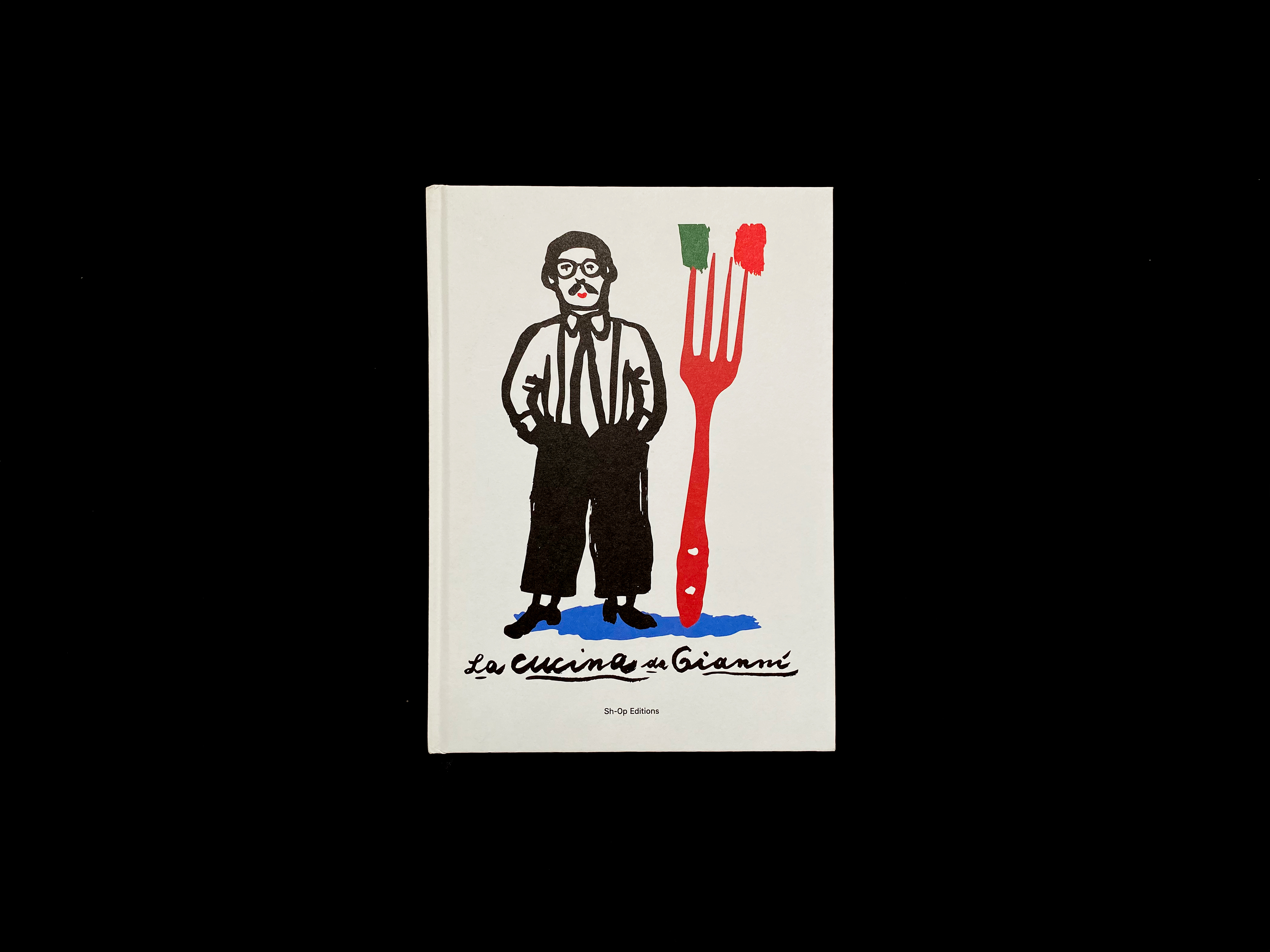 |
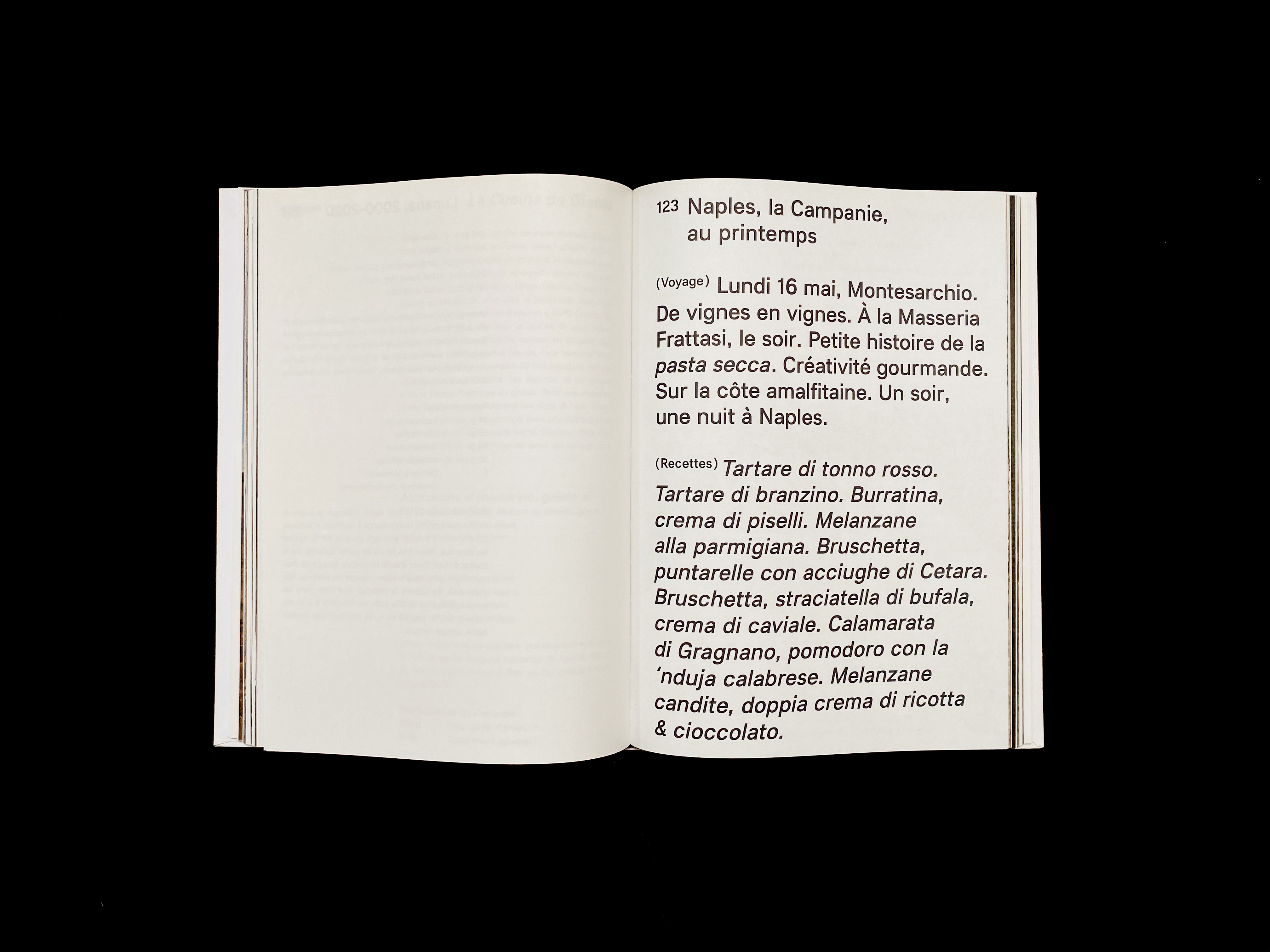
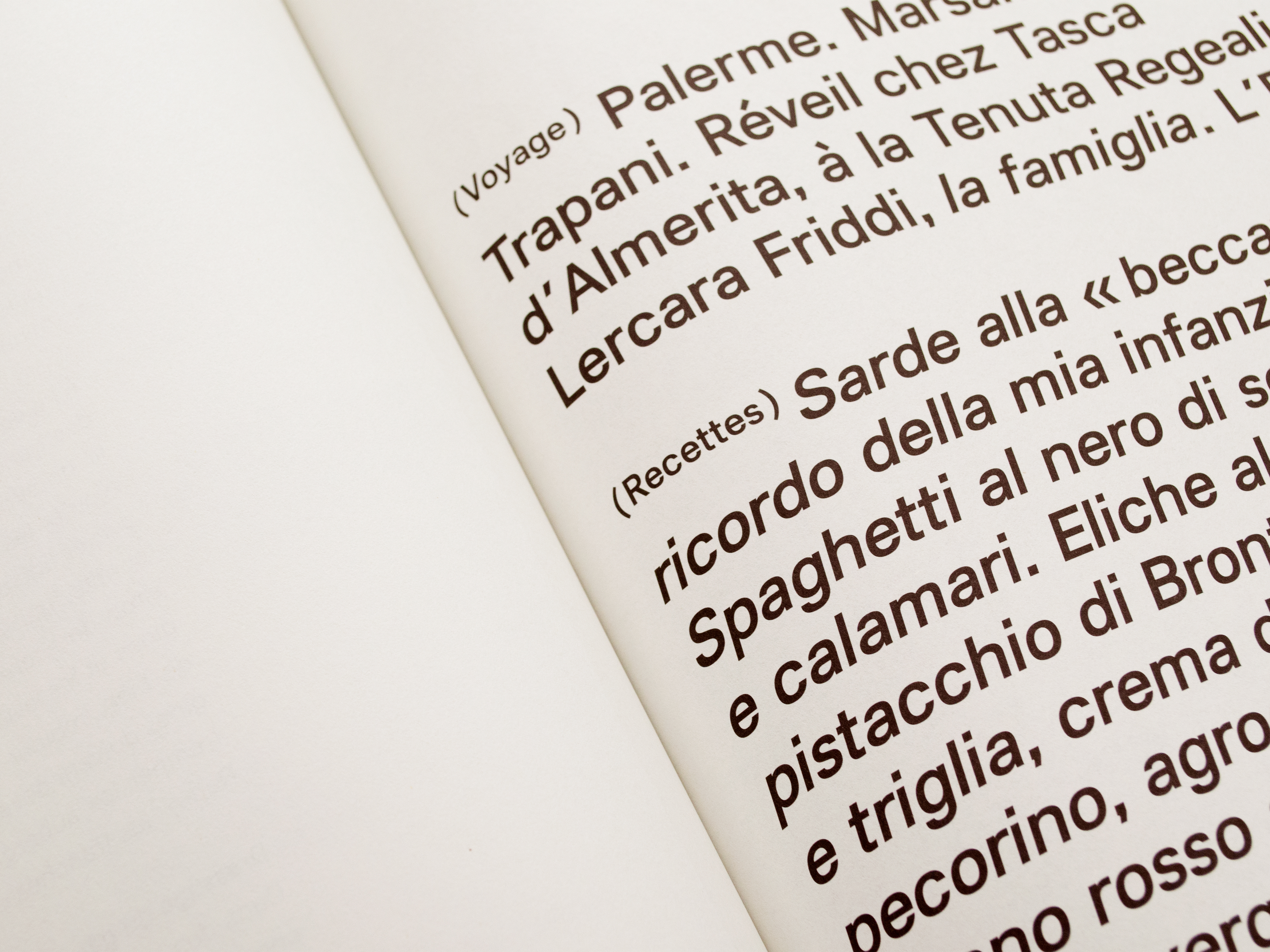
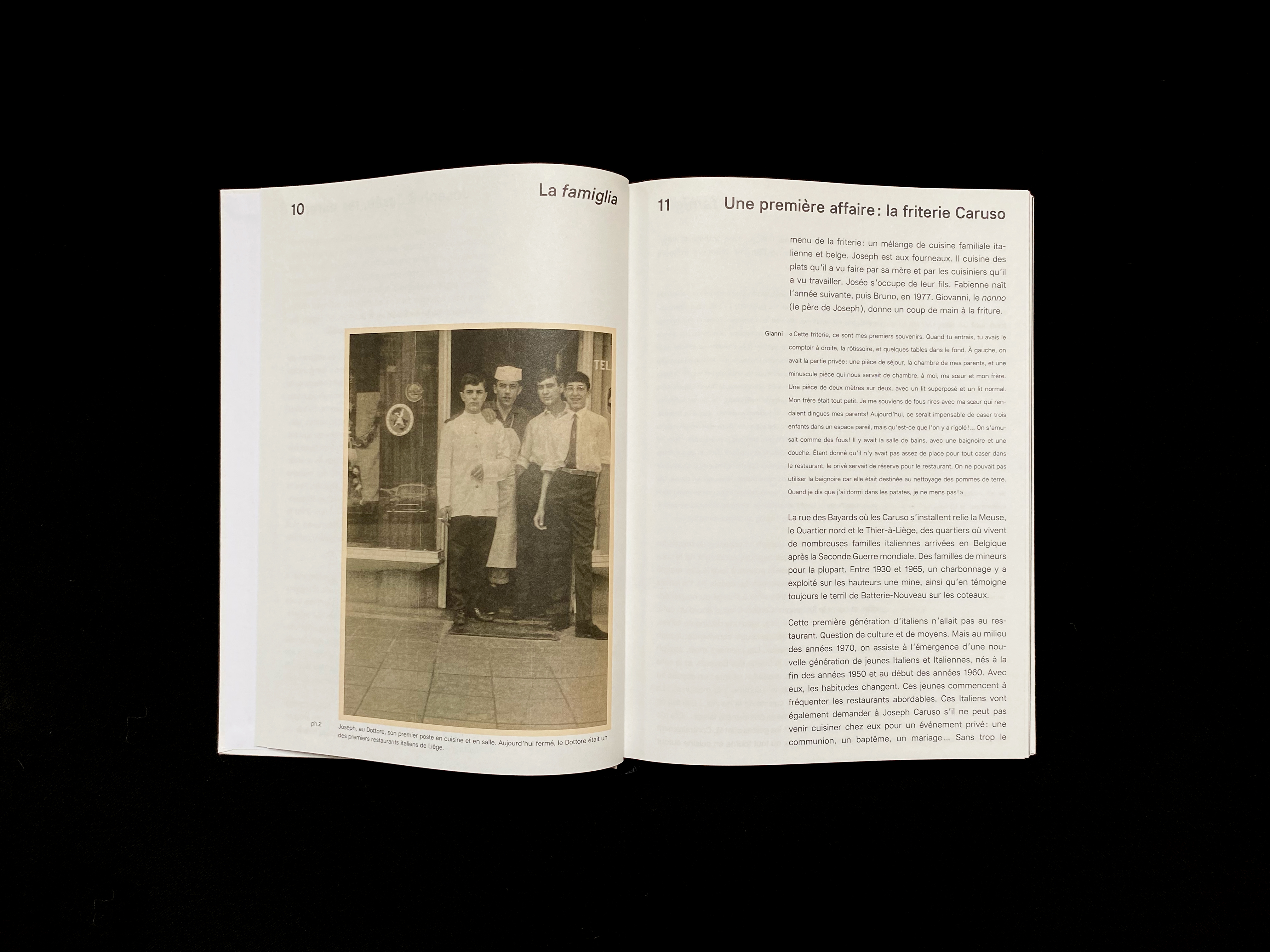
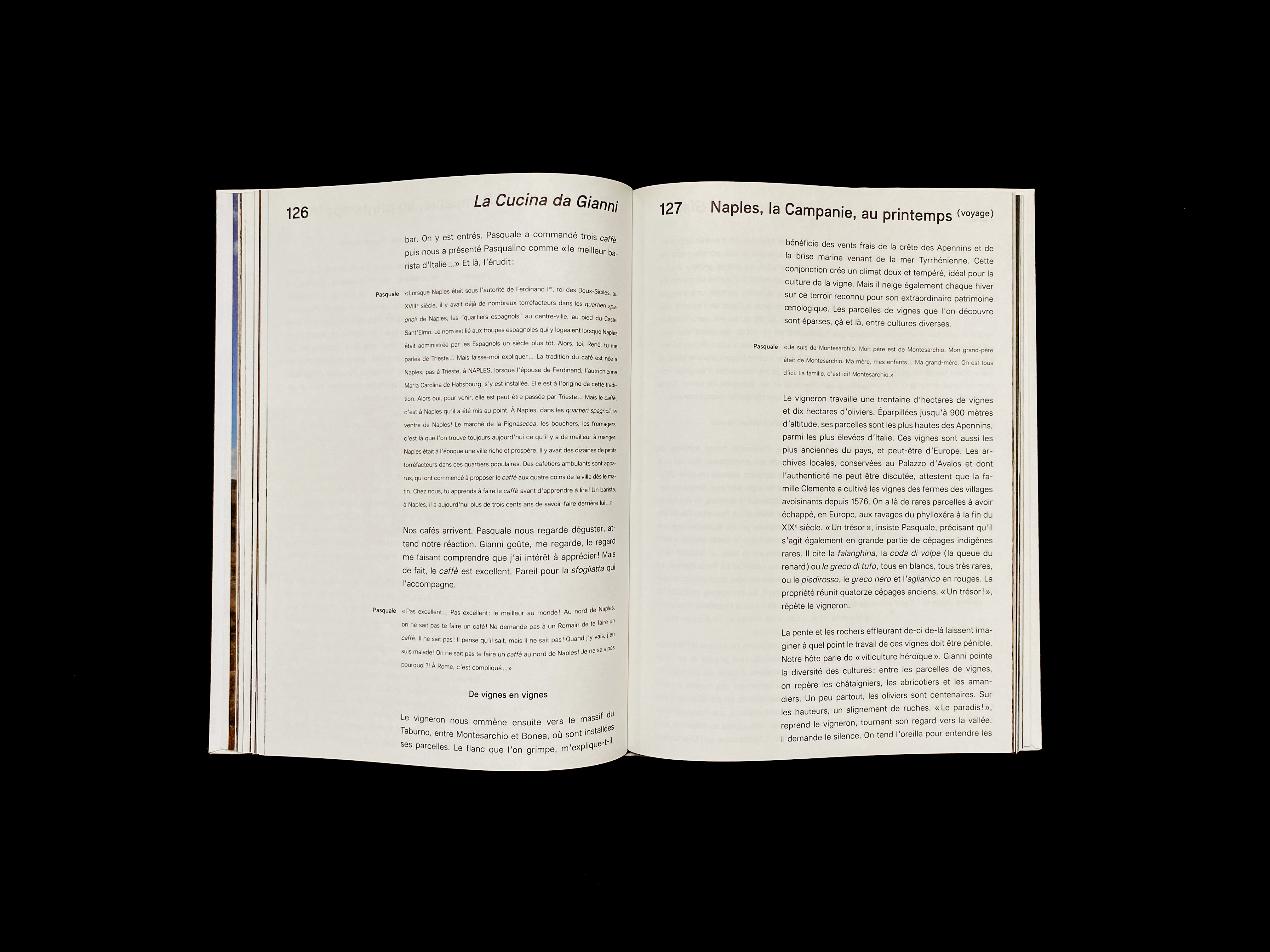
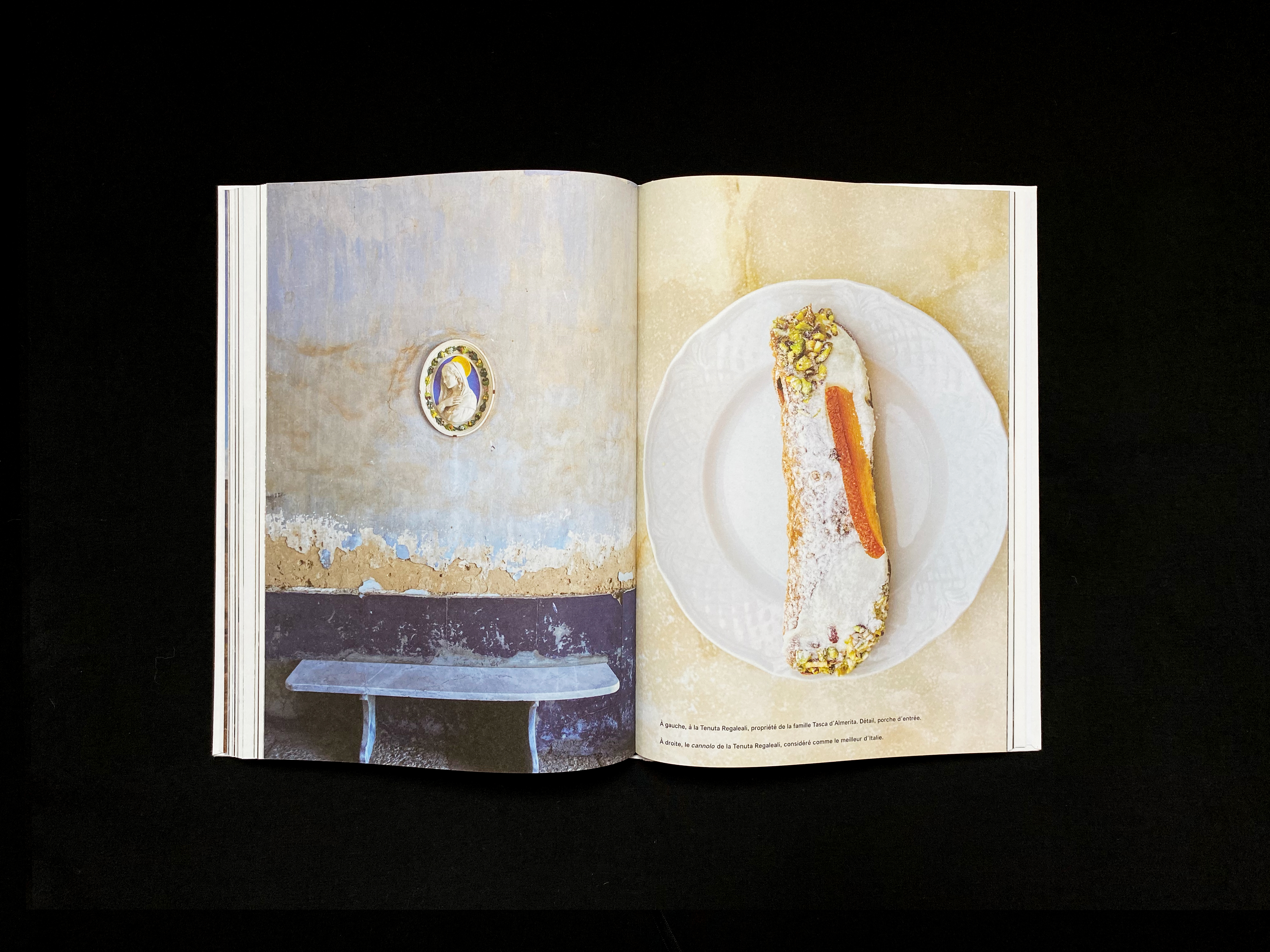
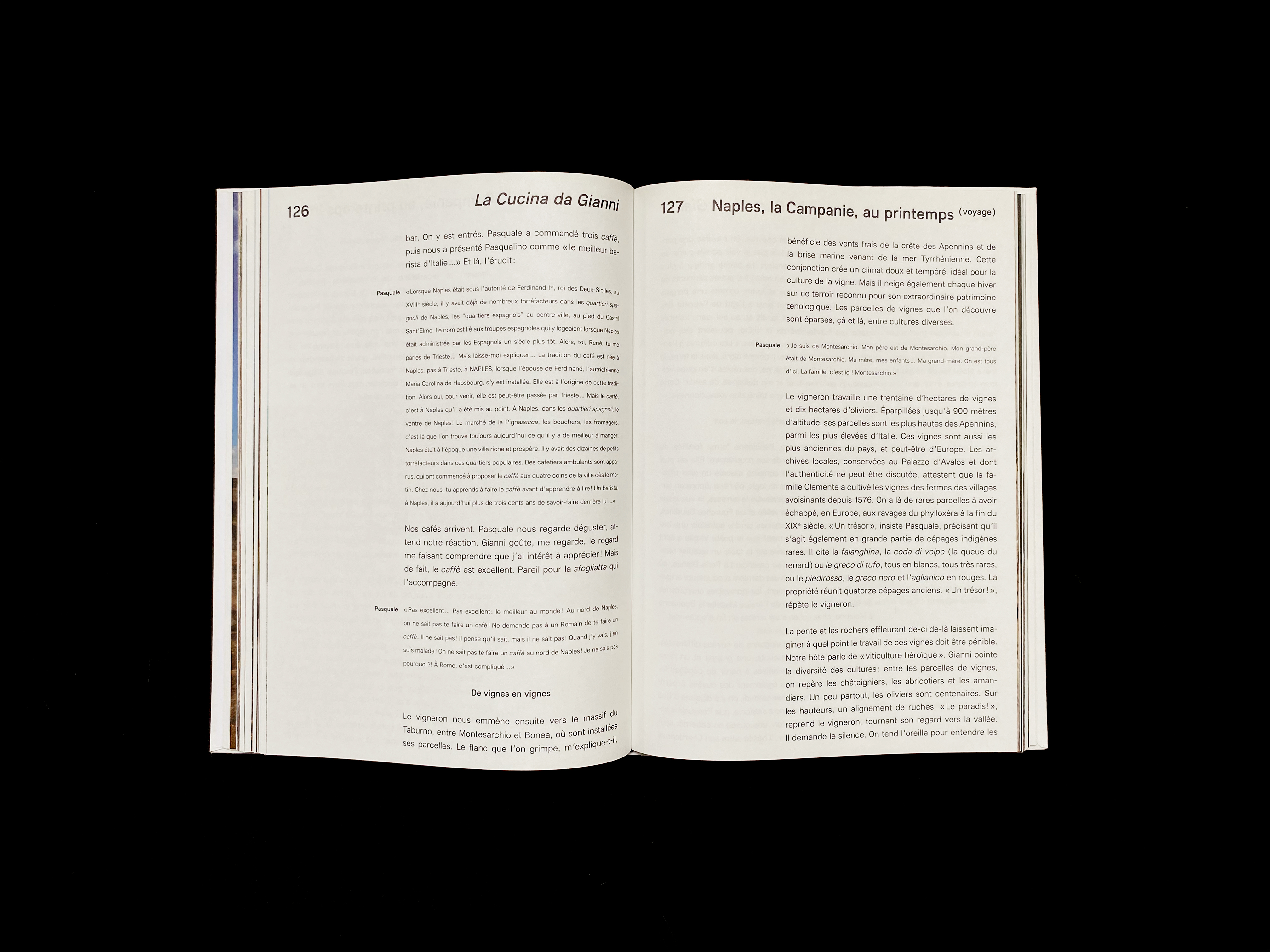
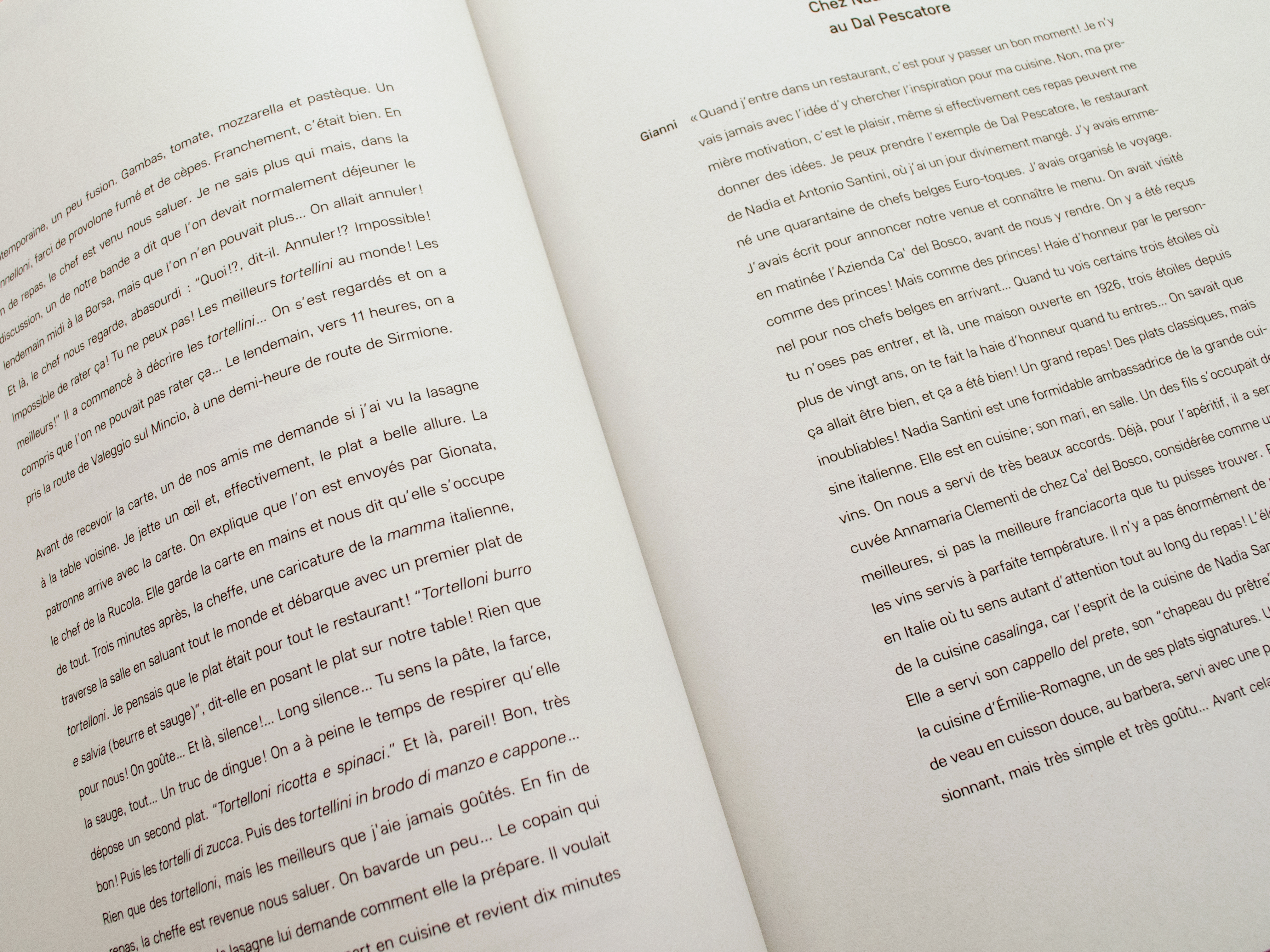
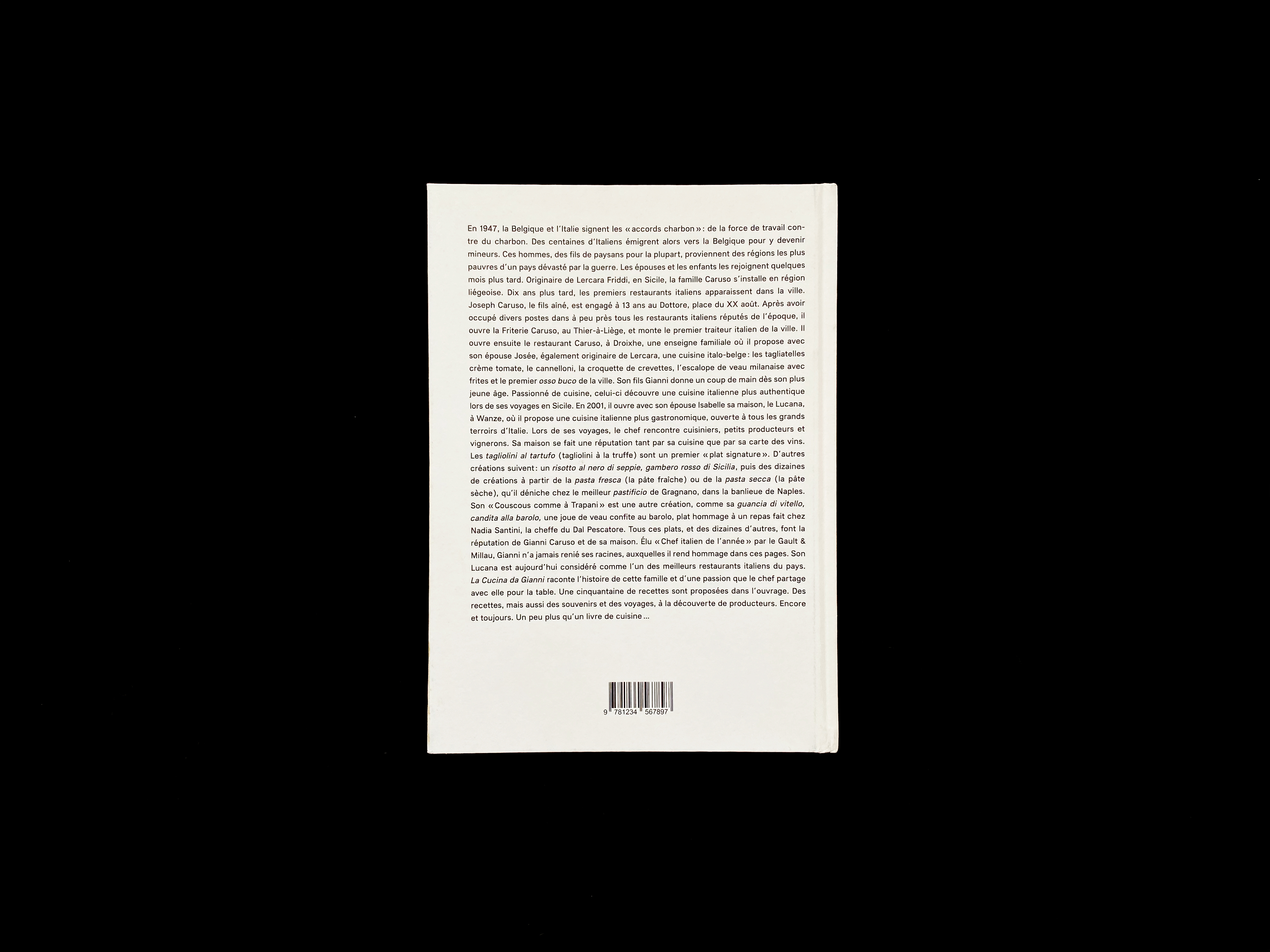
06 — La Cucina da Gianni | Editorial |
|---|
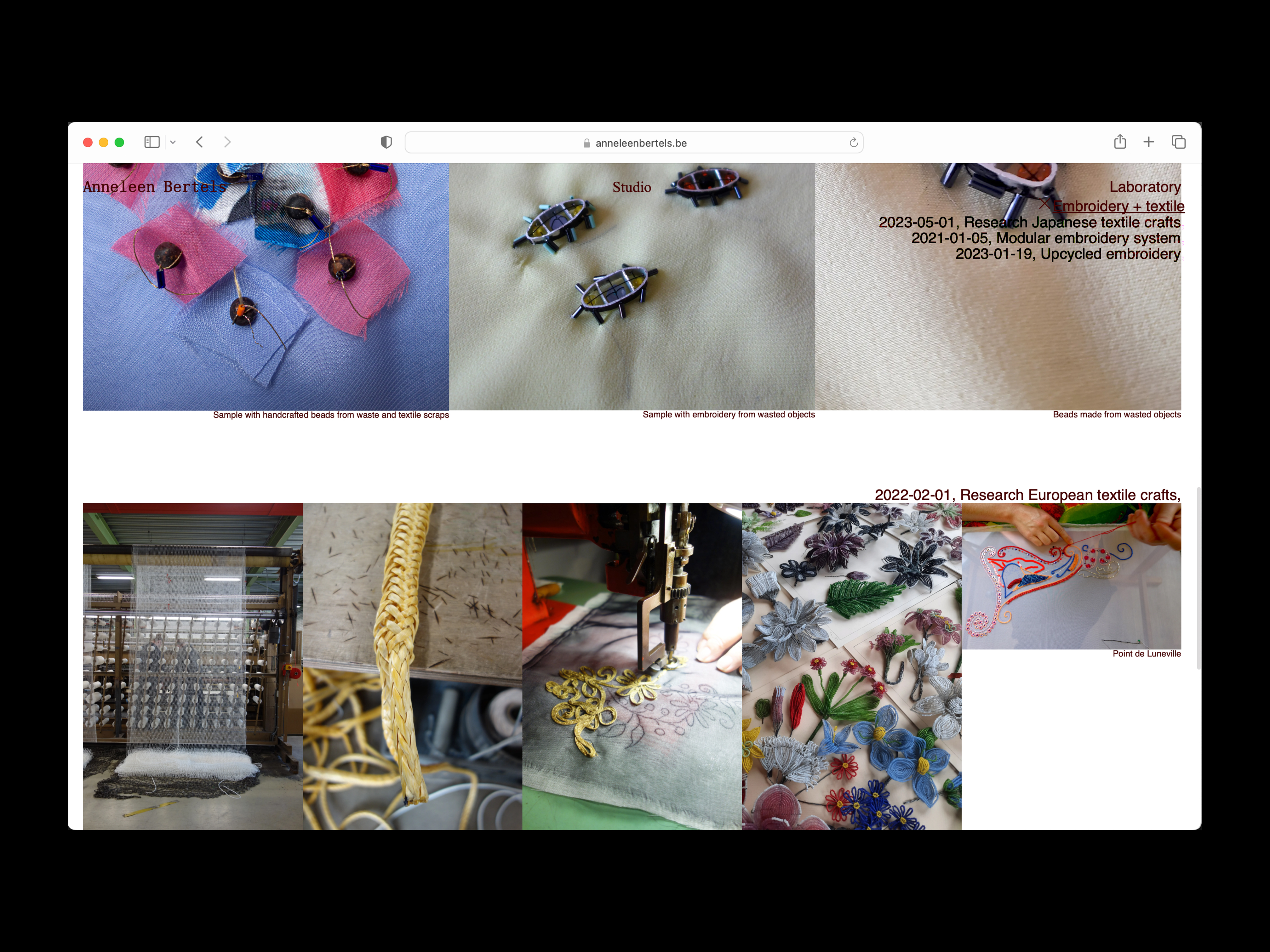 |
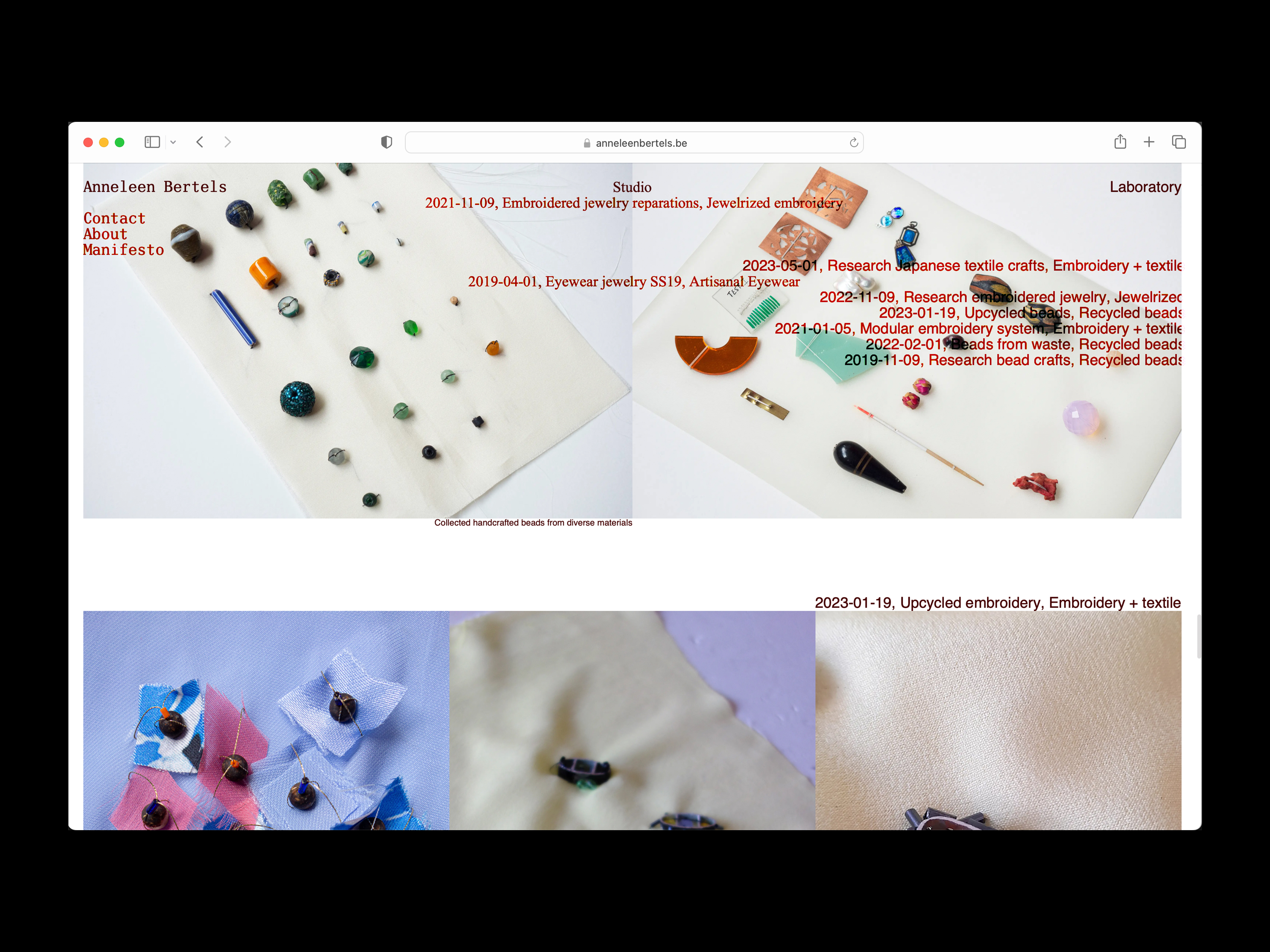
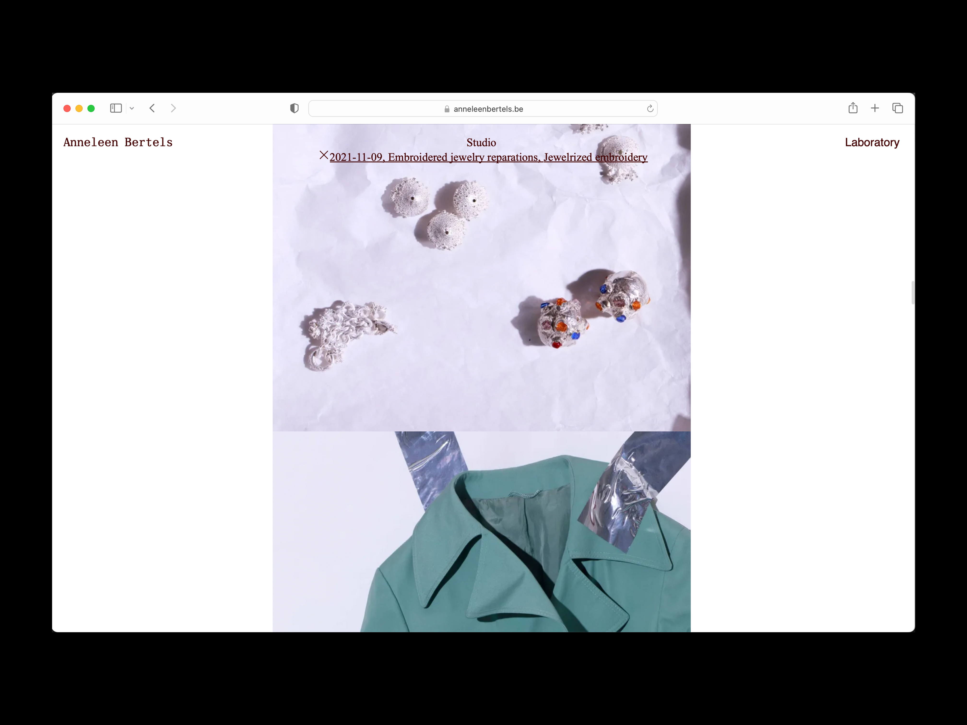
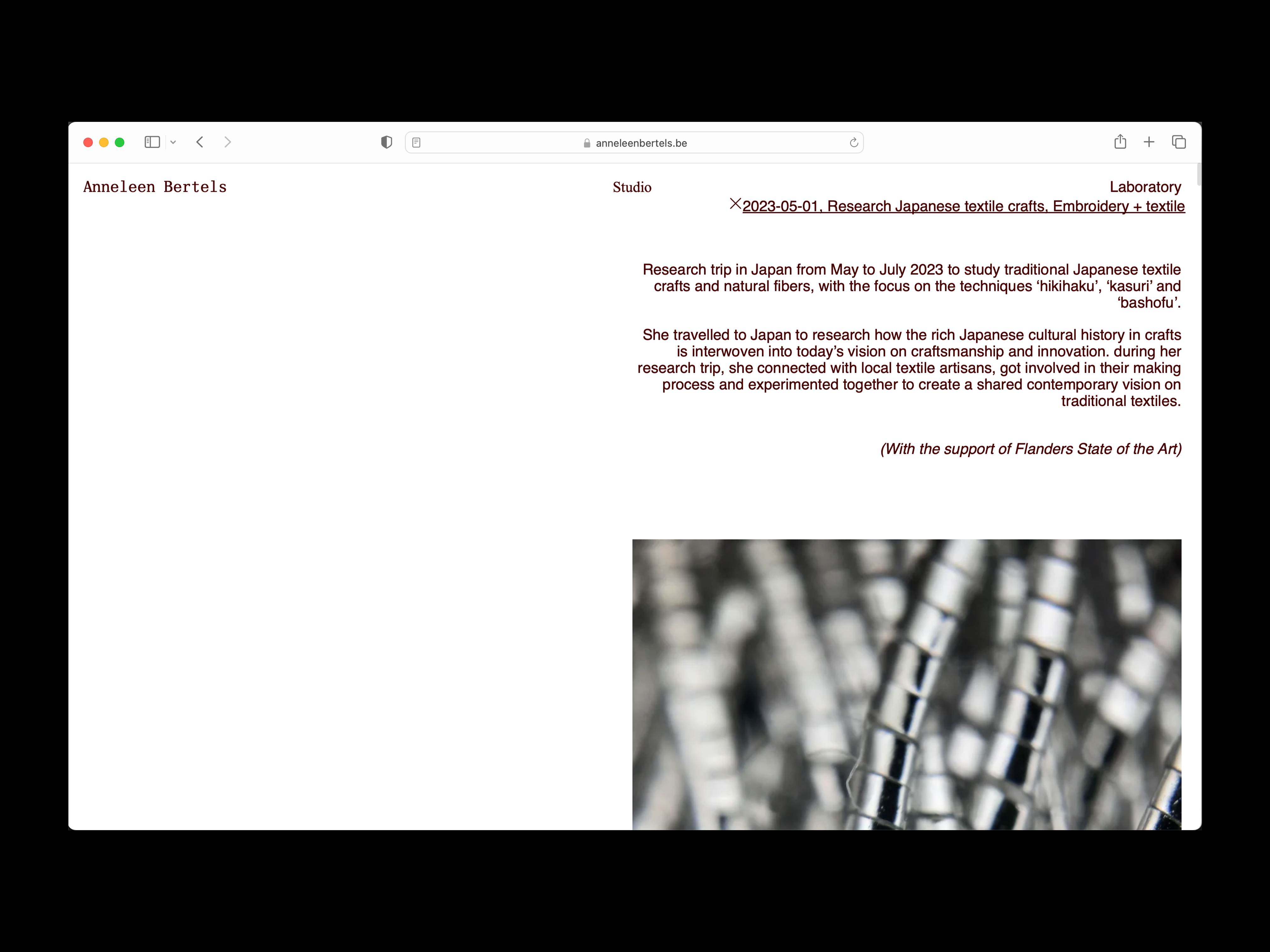
05 — Anneleen Bertels | Web |
|---|
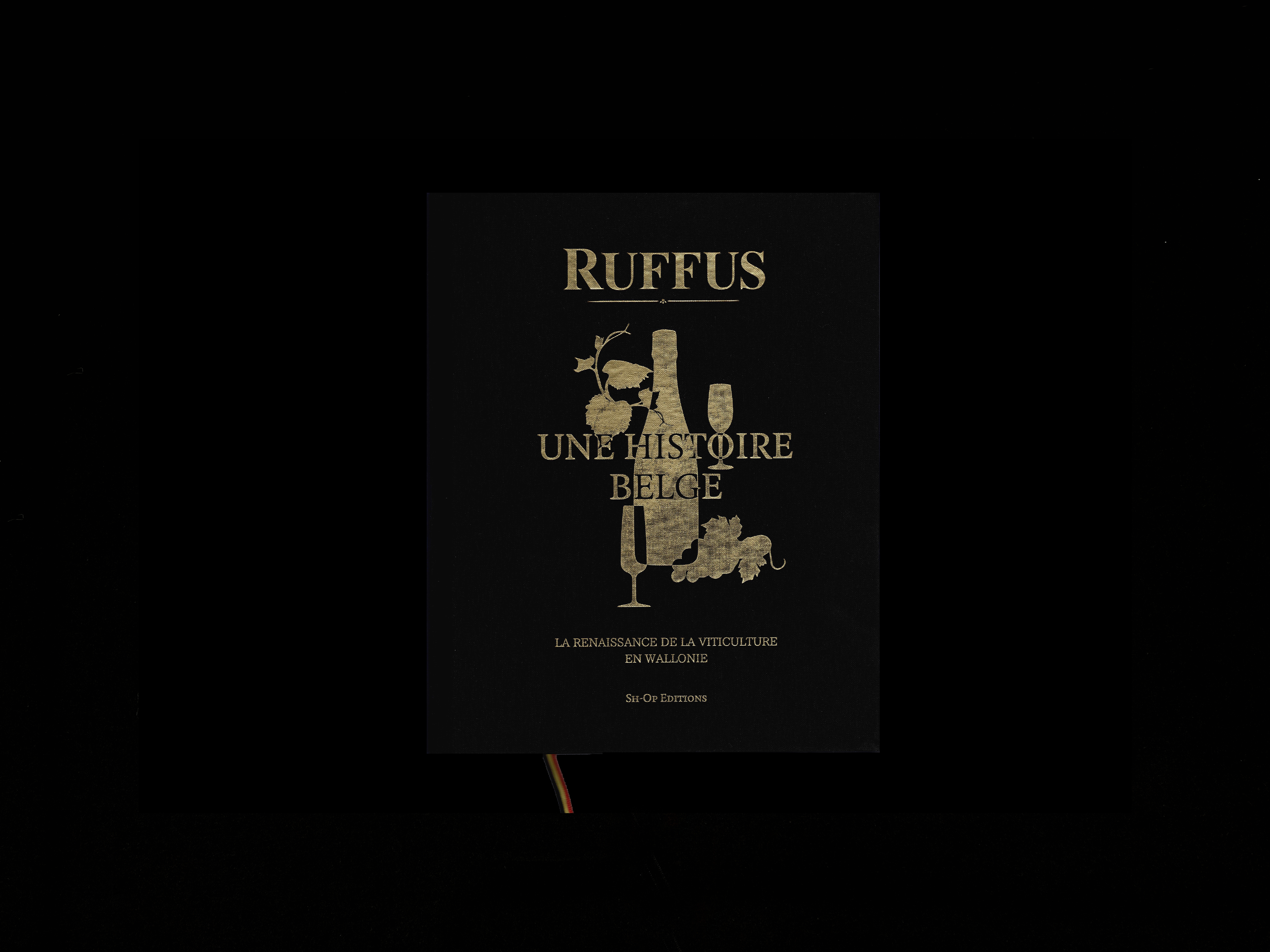 |
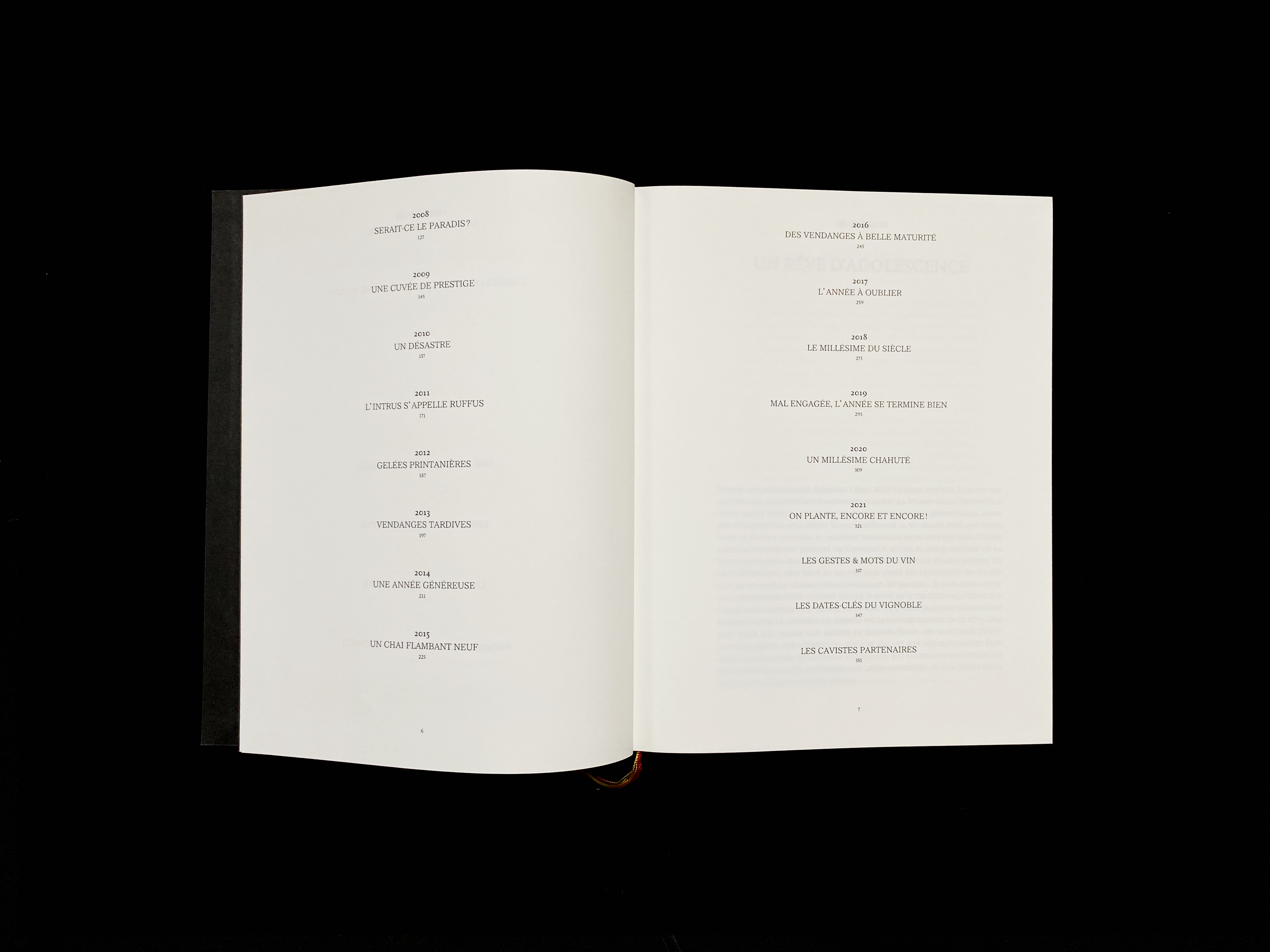
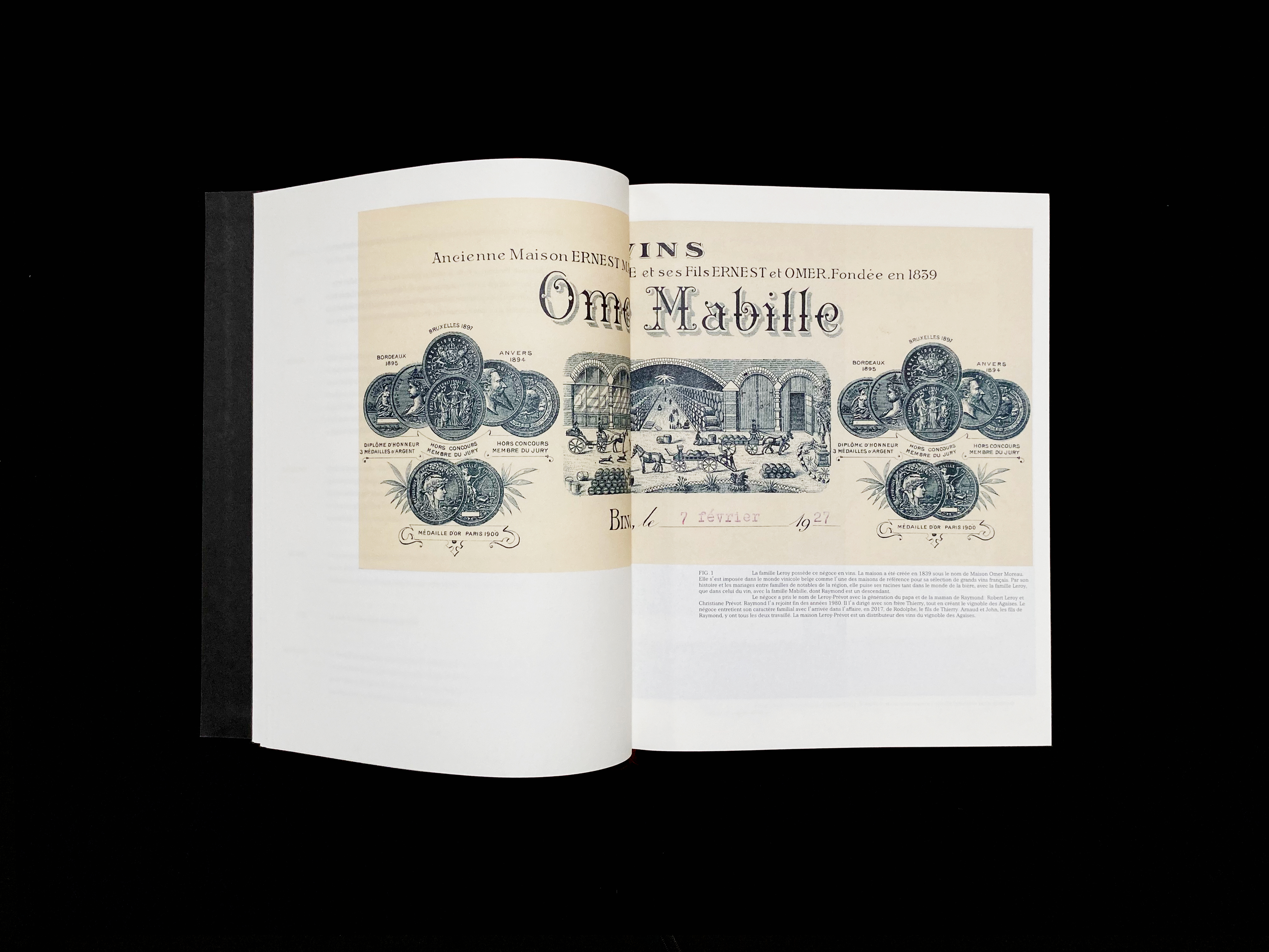
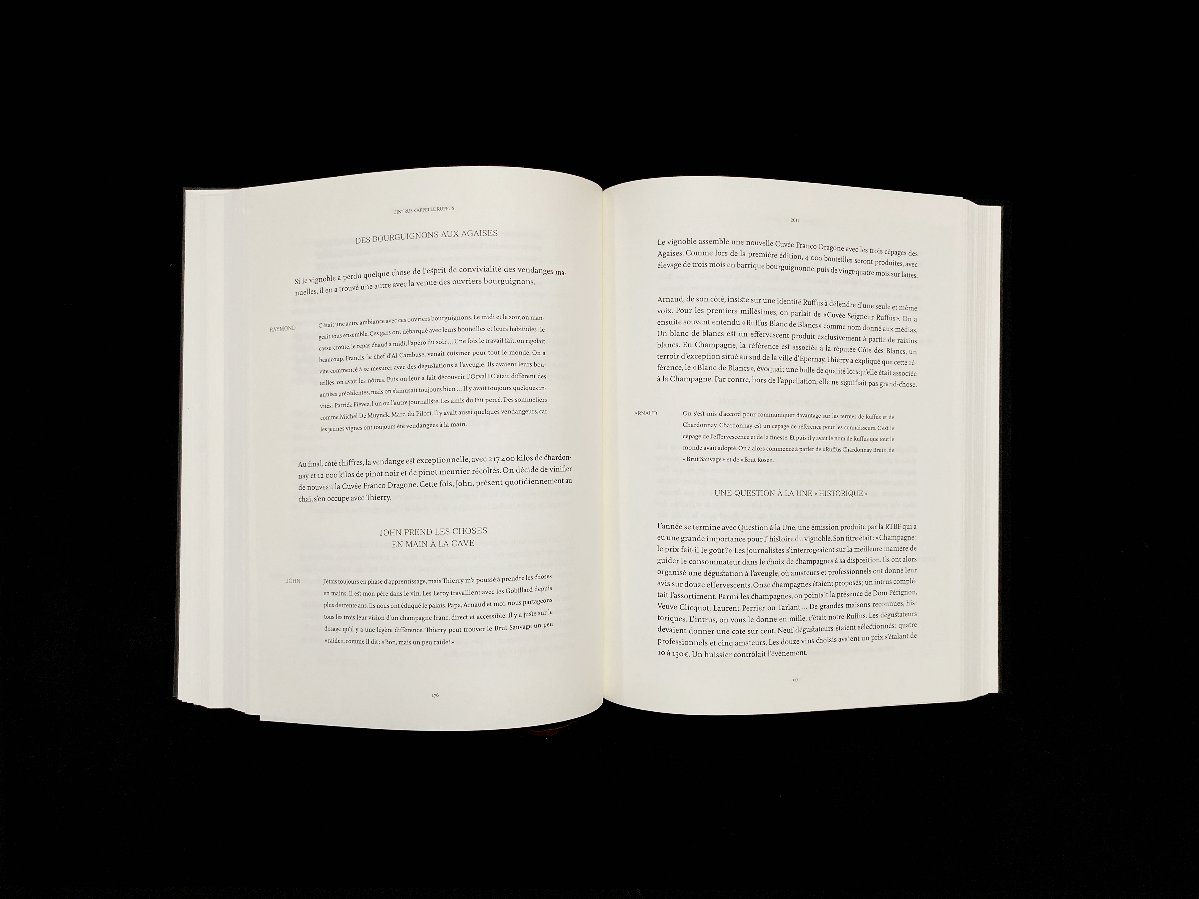
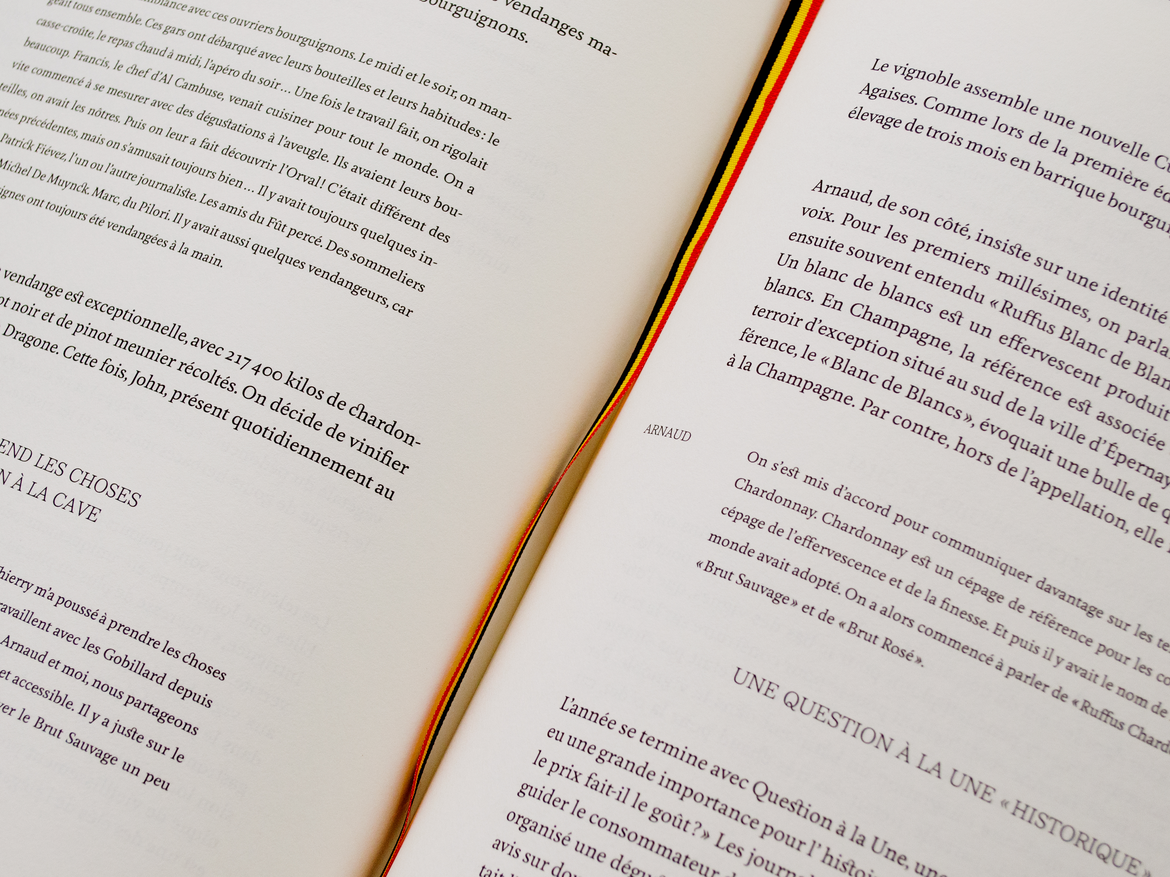
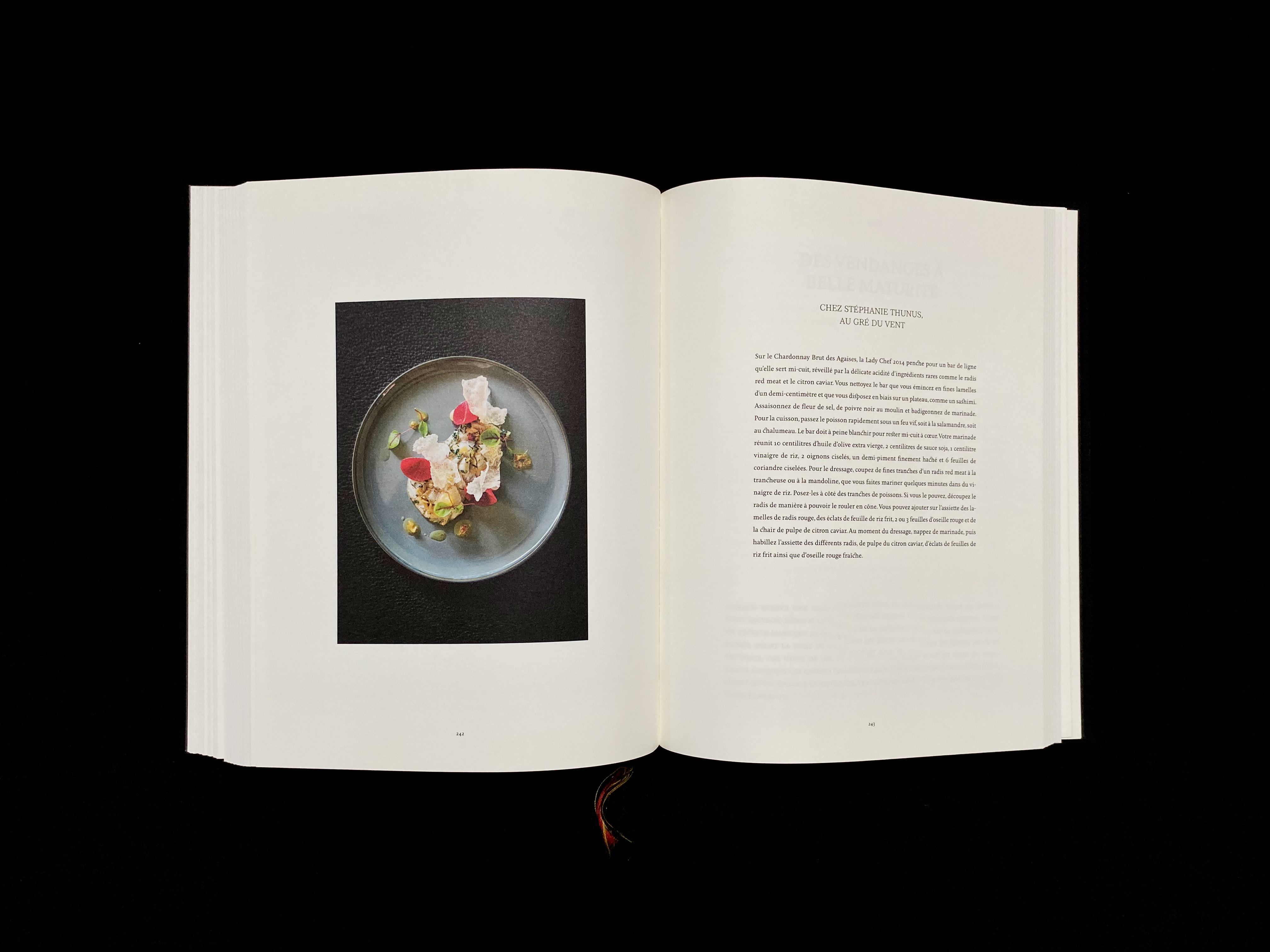
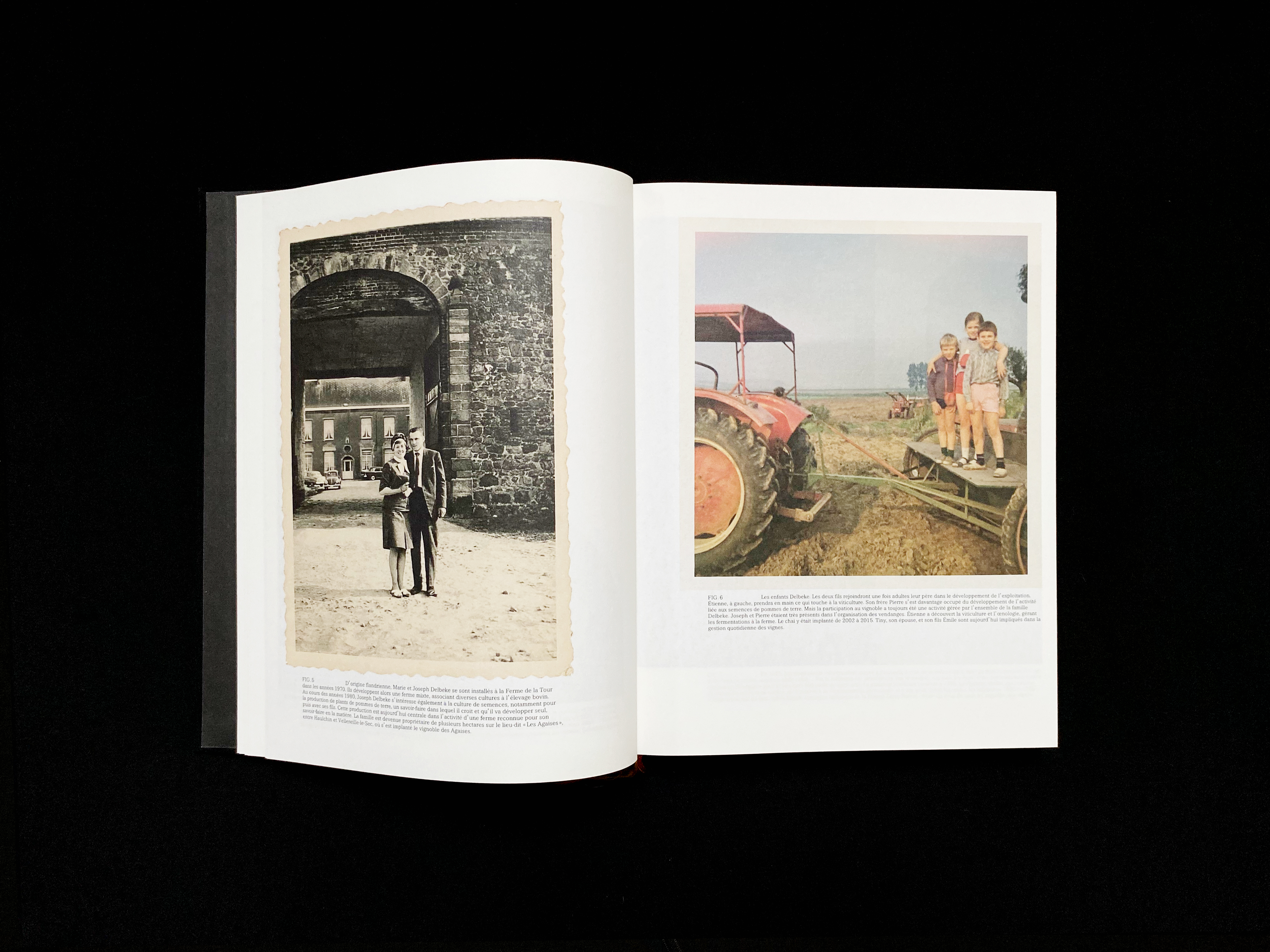
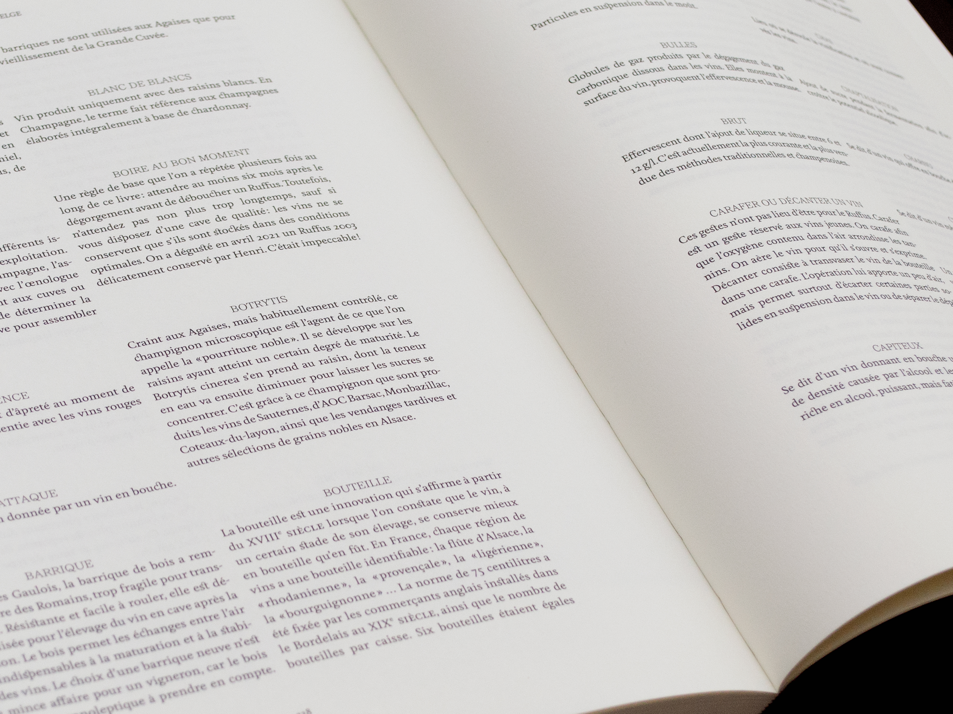
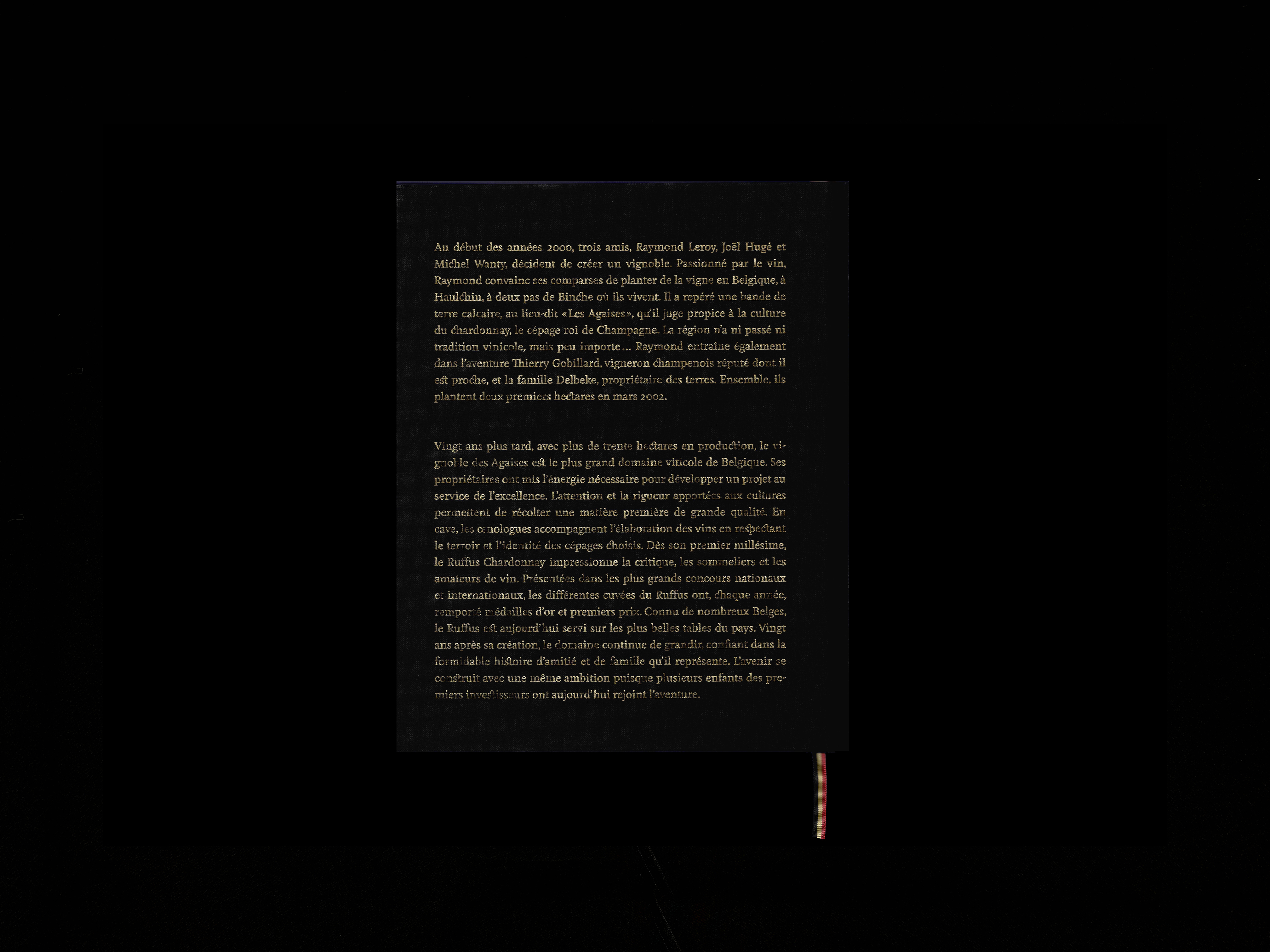
04 — Ruffus, une histoire belge | Editorial |
|---|
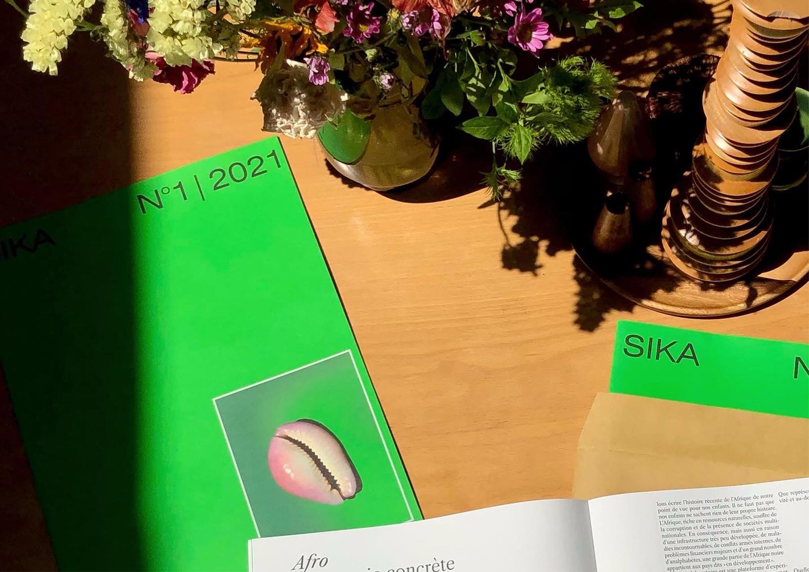 |
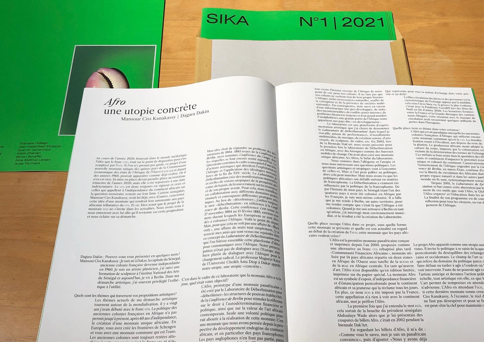
03 — Sika n°1 | Editorial |
|---|
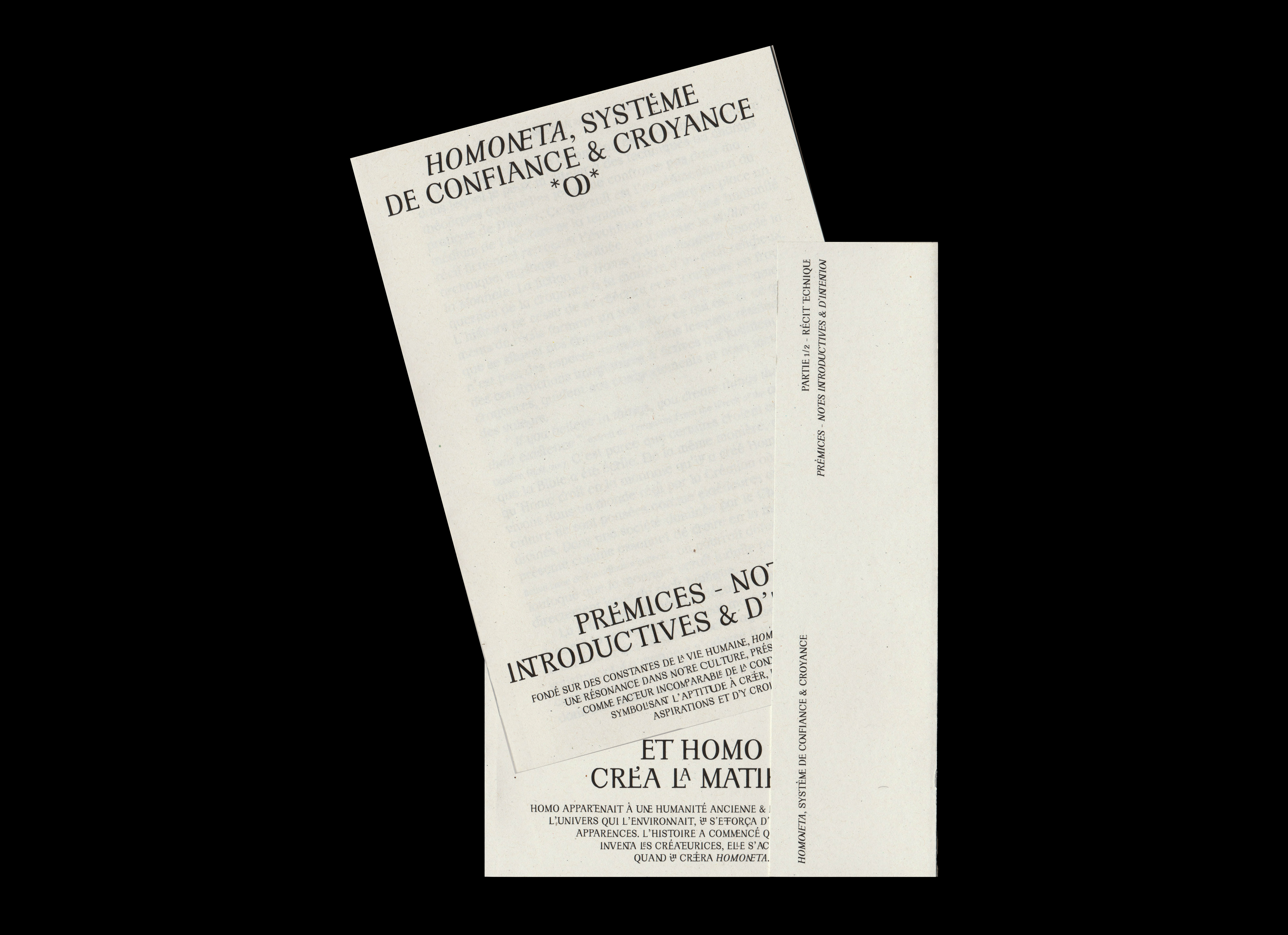 |
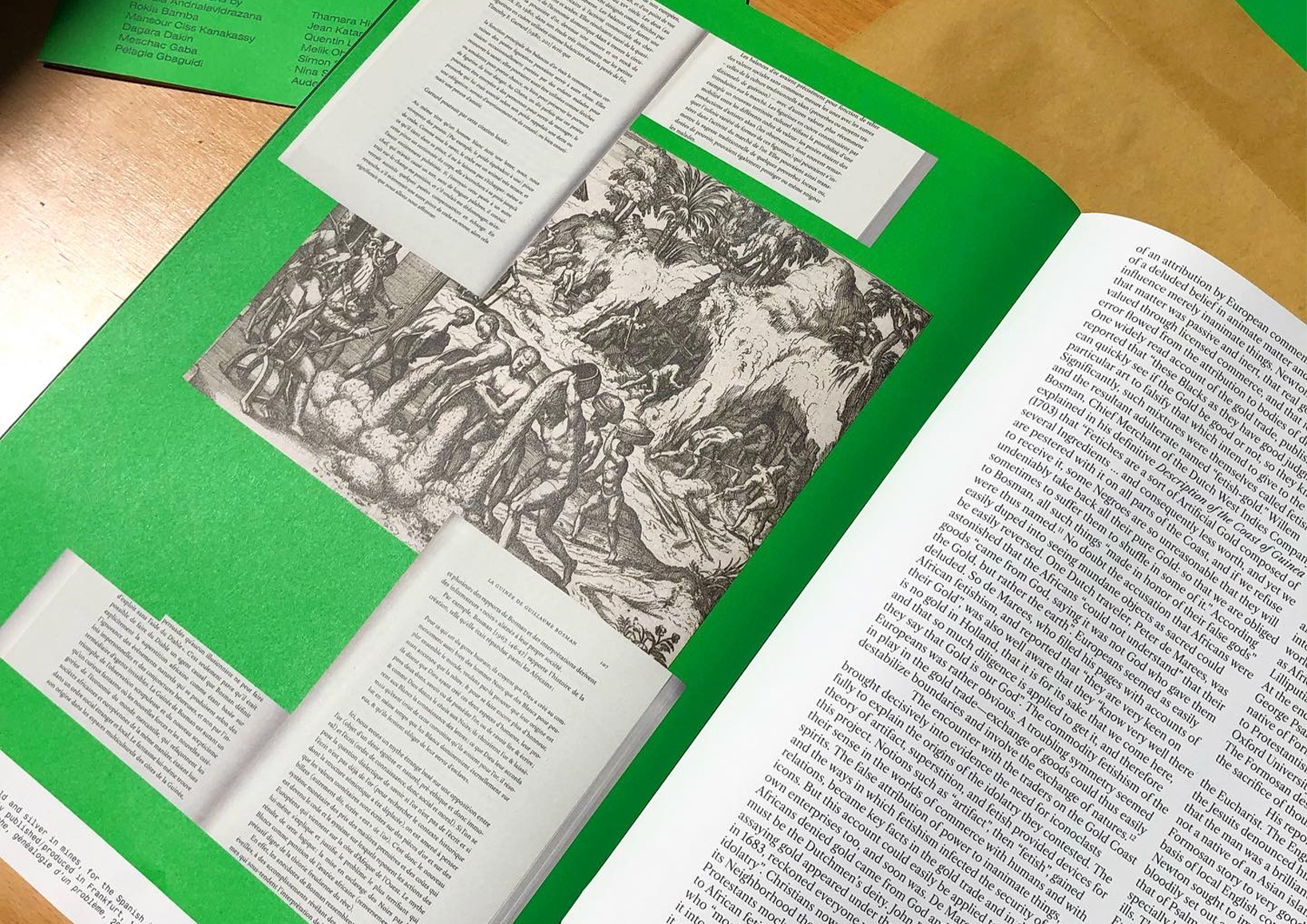
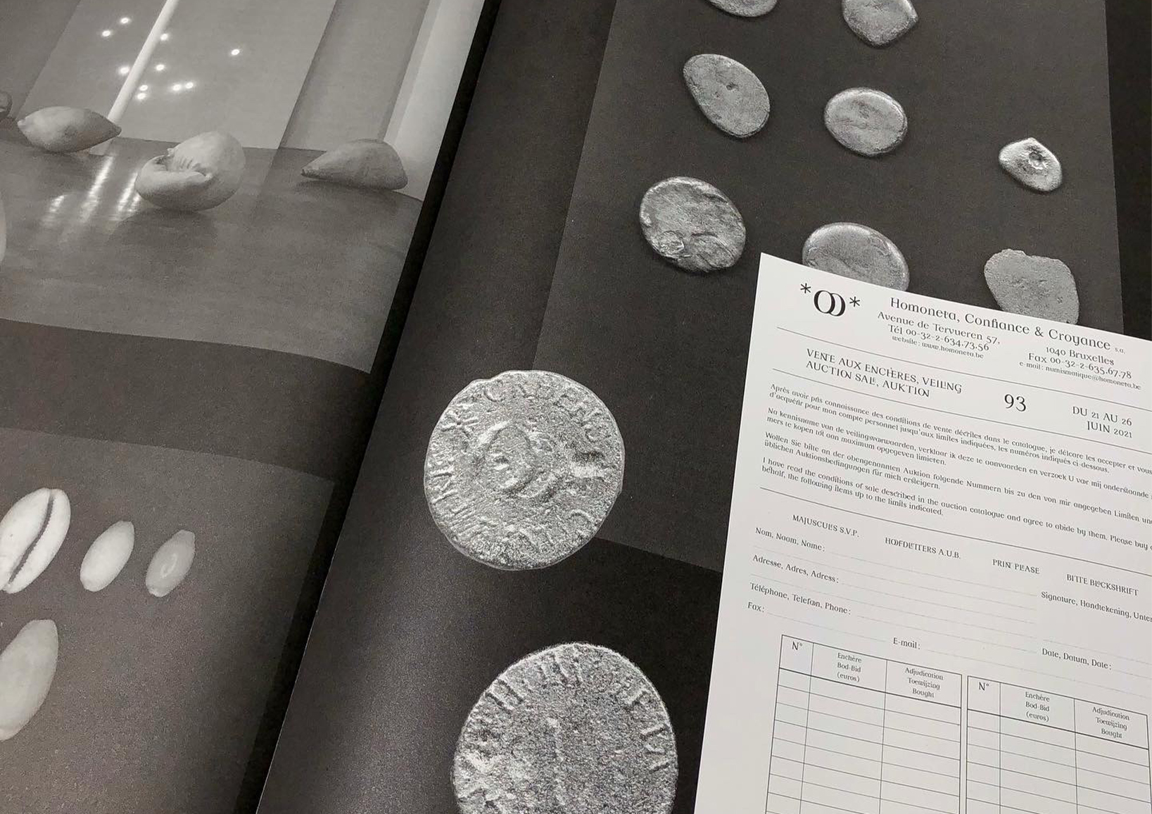
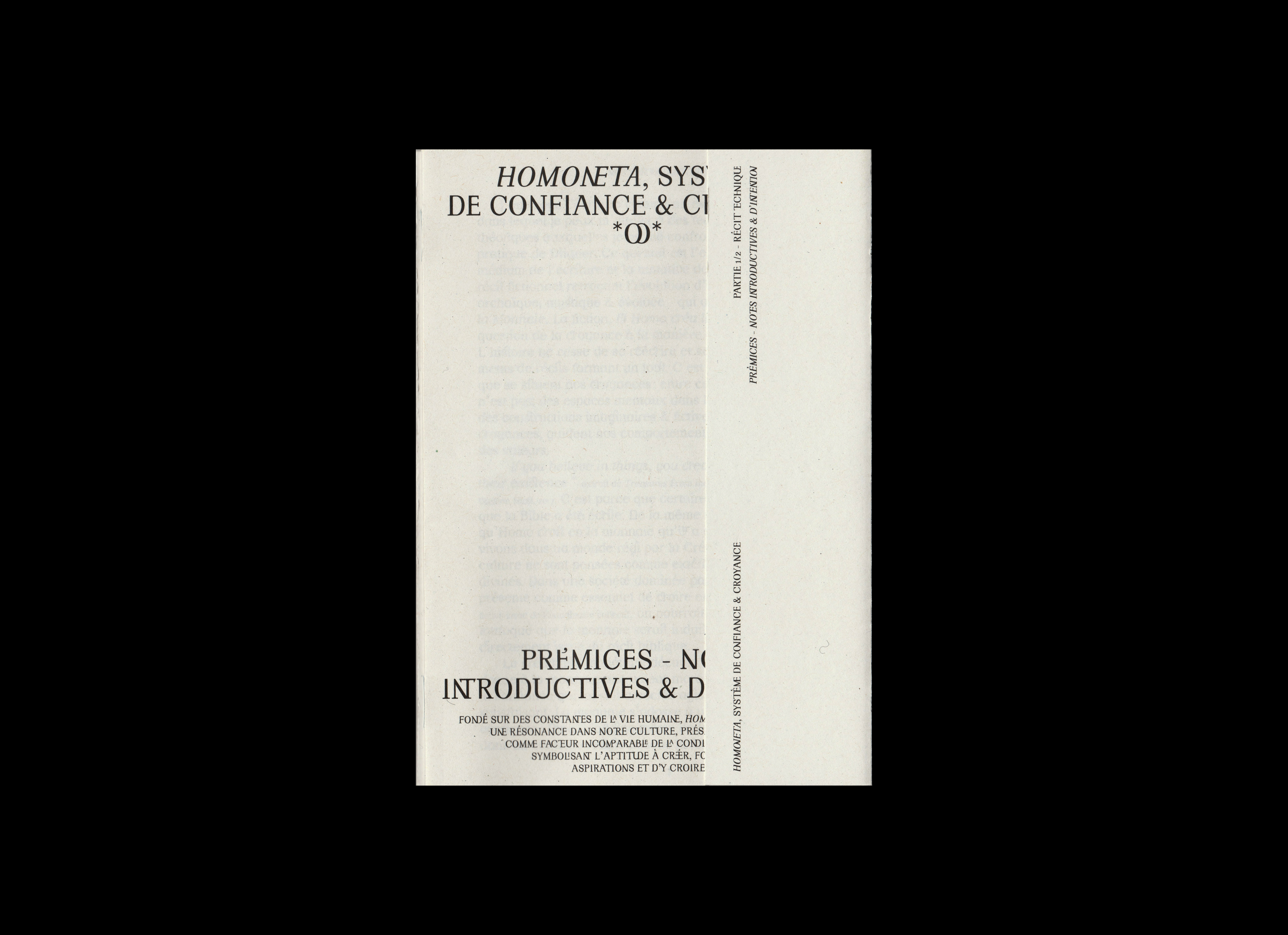
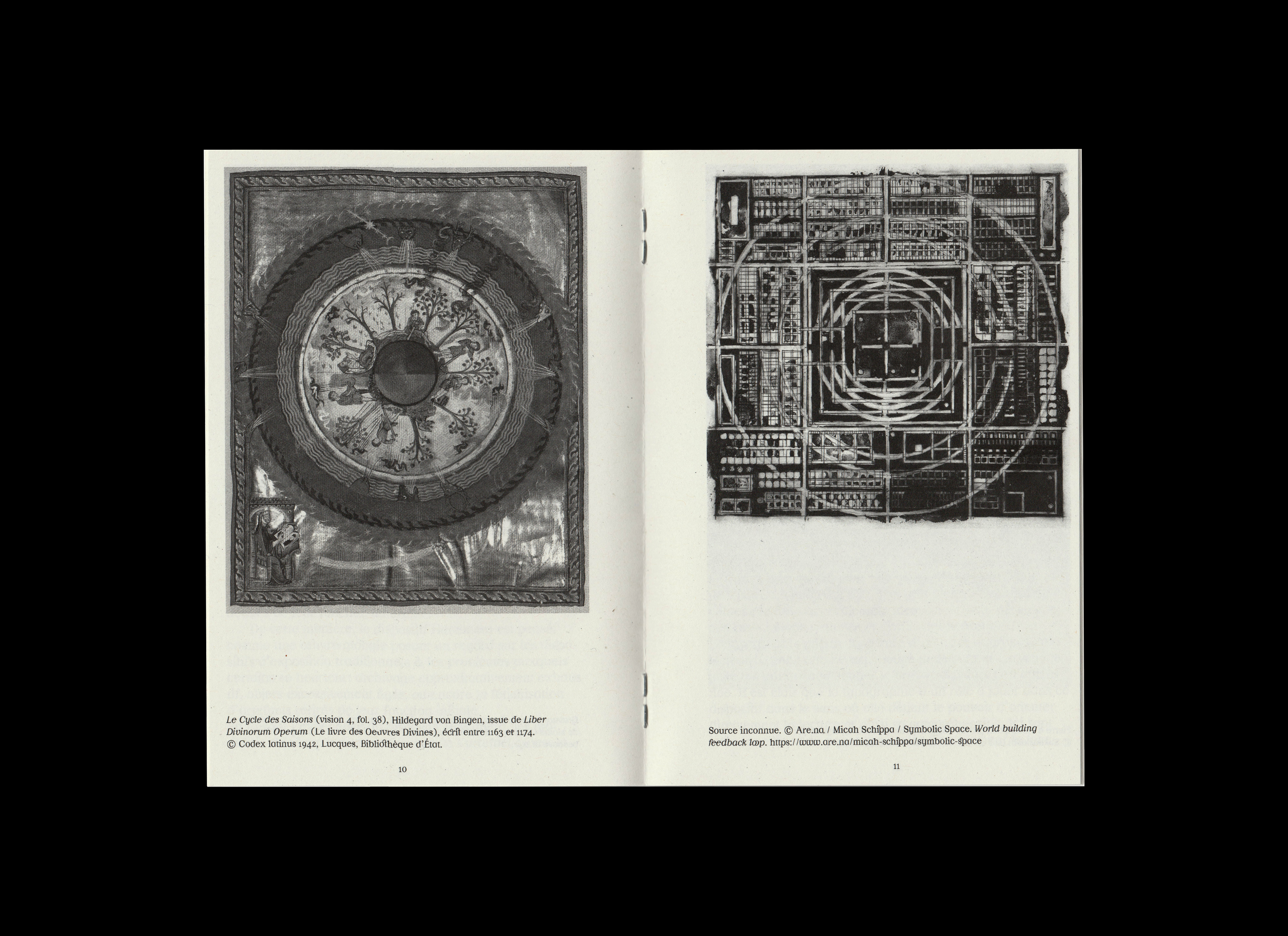
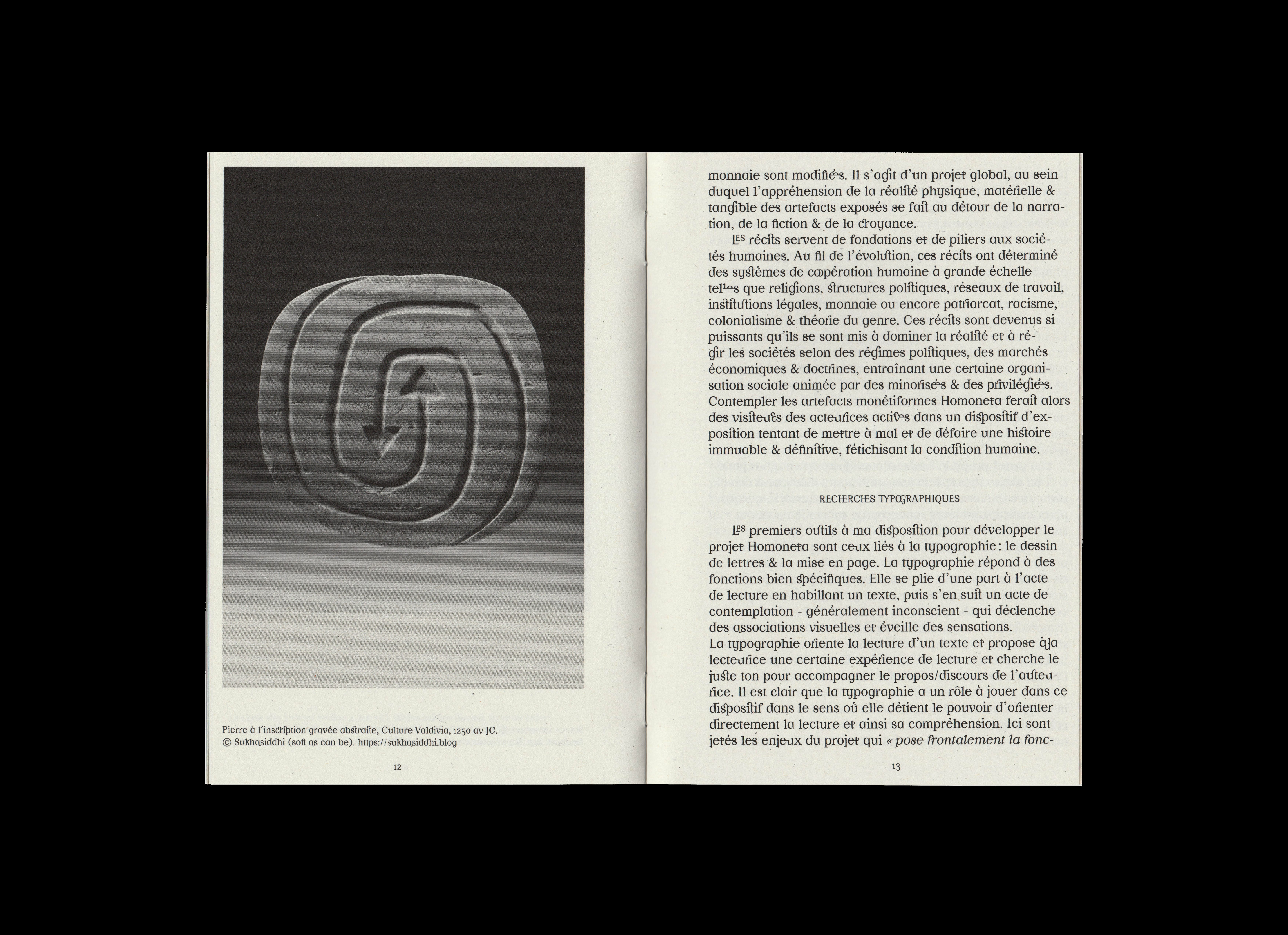
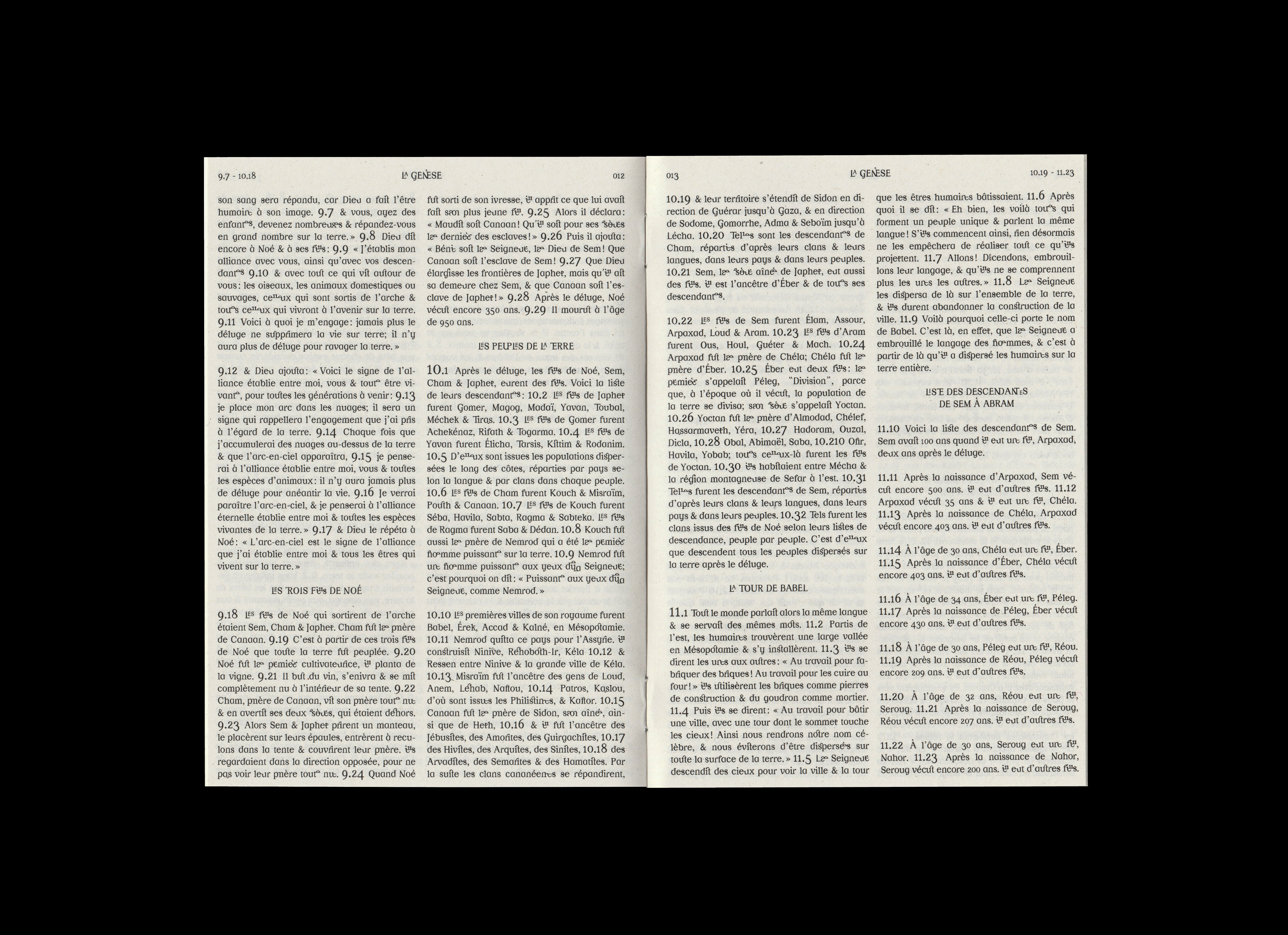
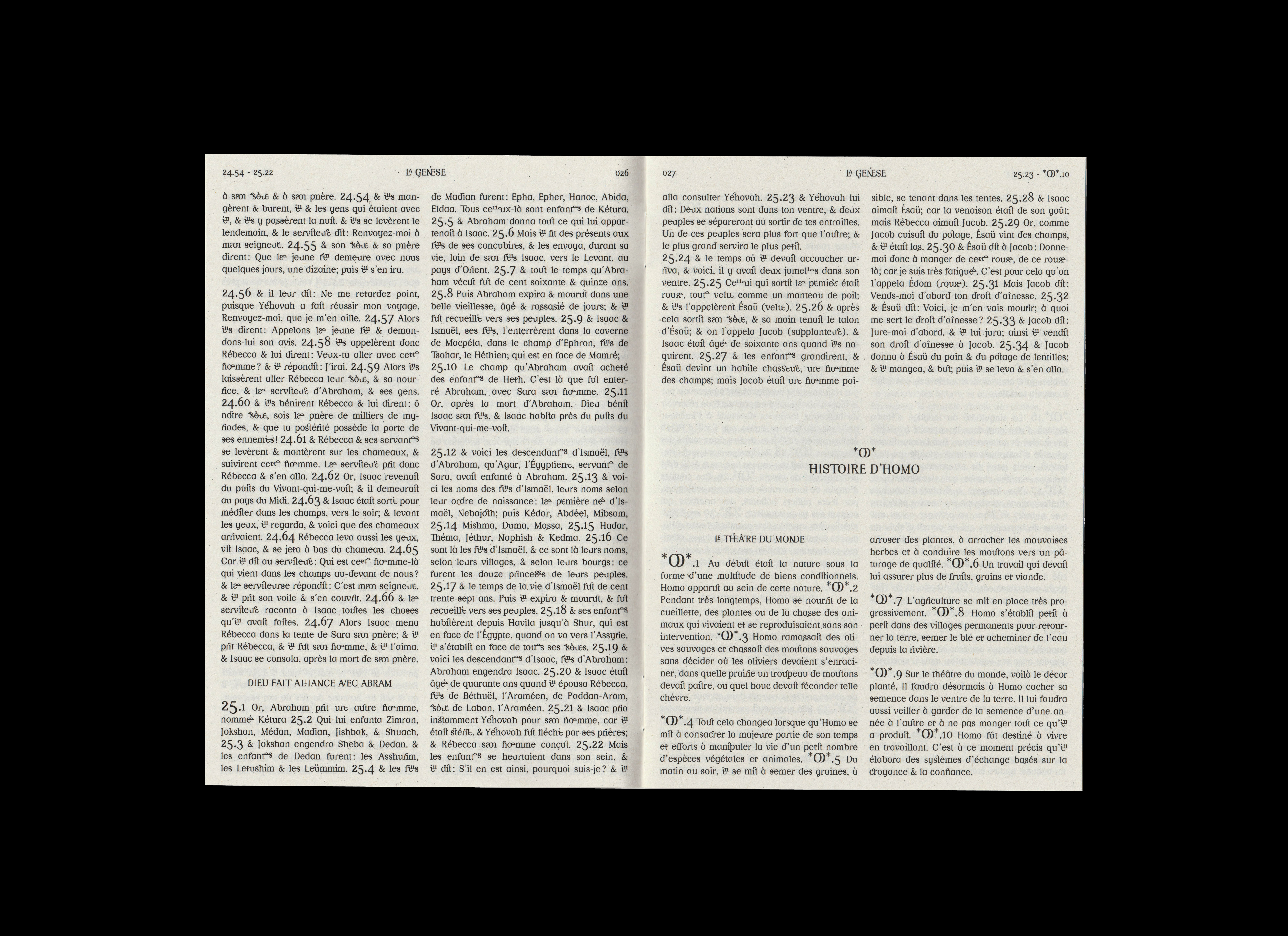
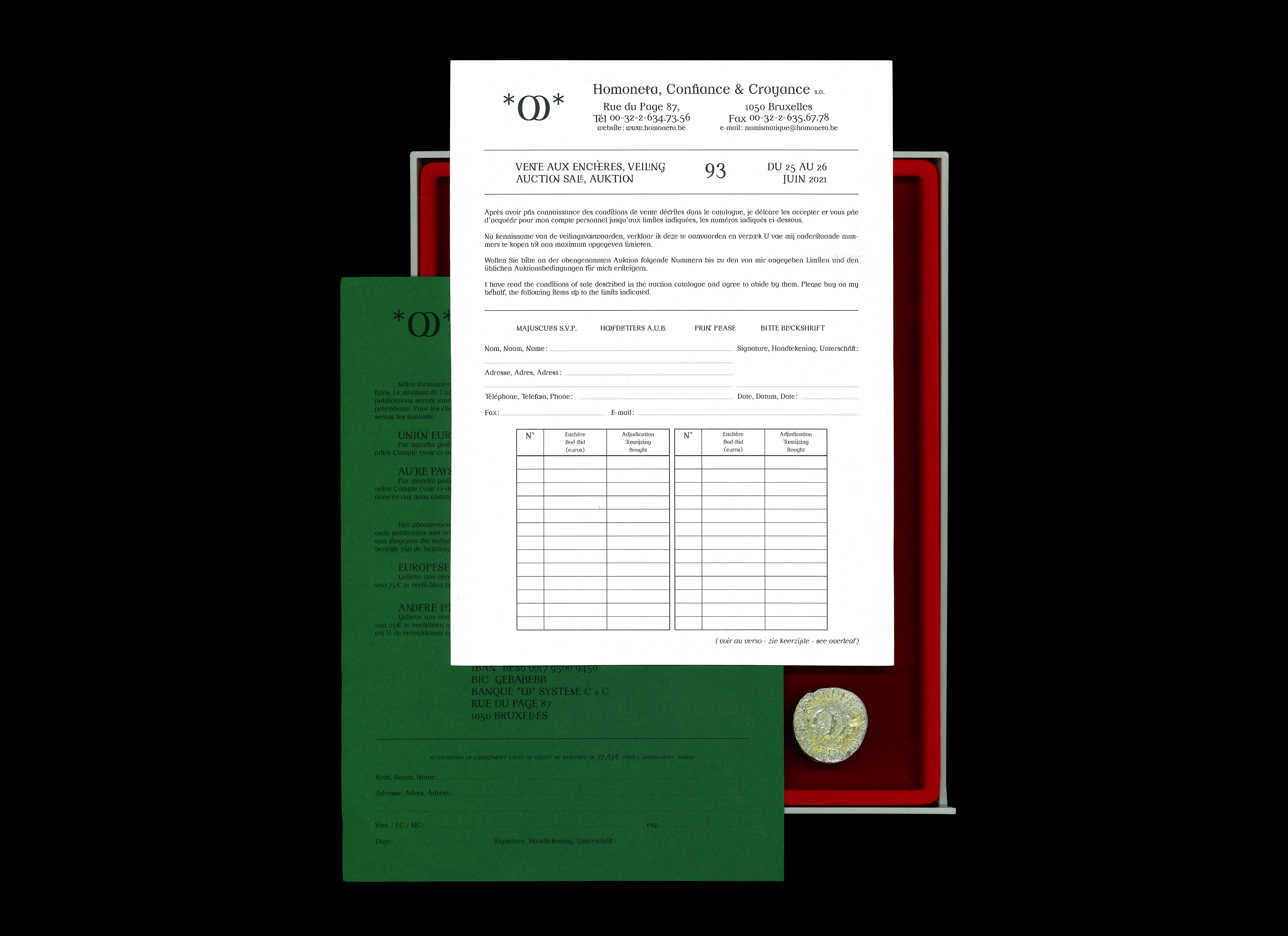
02 — Et Homo créa la Matière | Typeface |
|---|
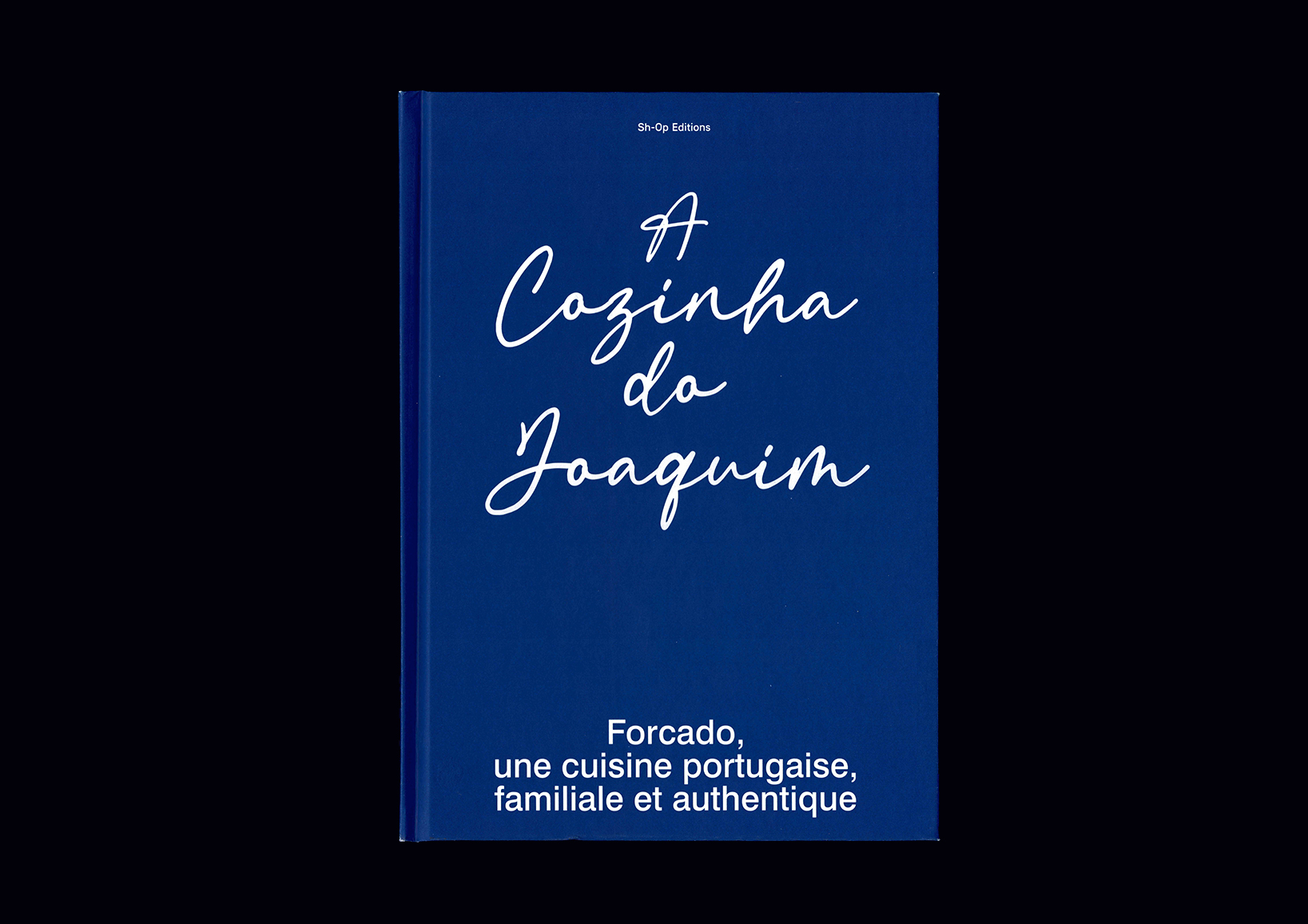 |
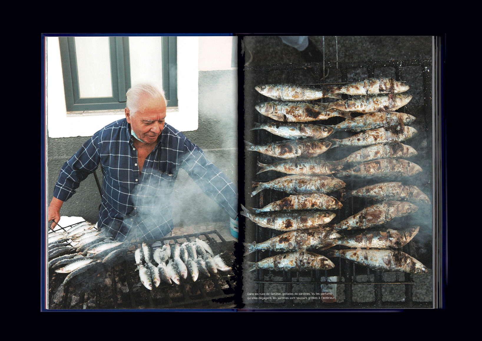
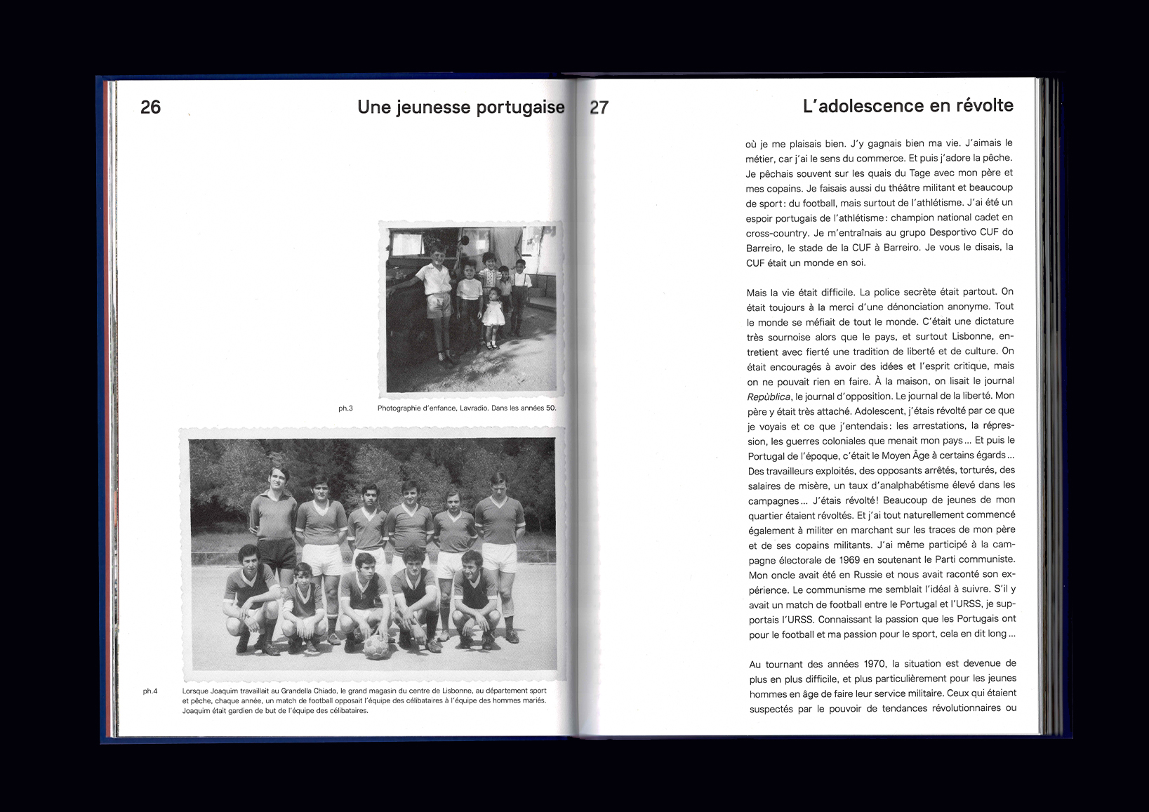
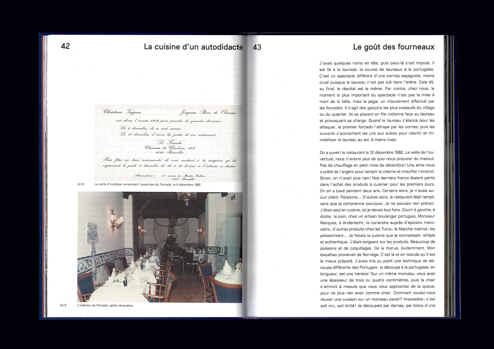
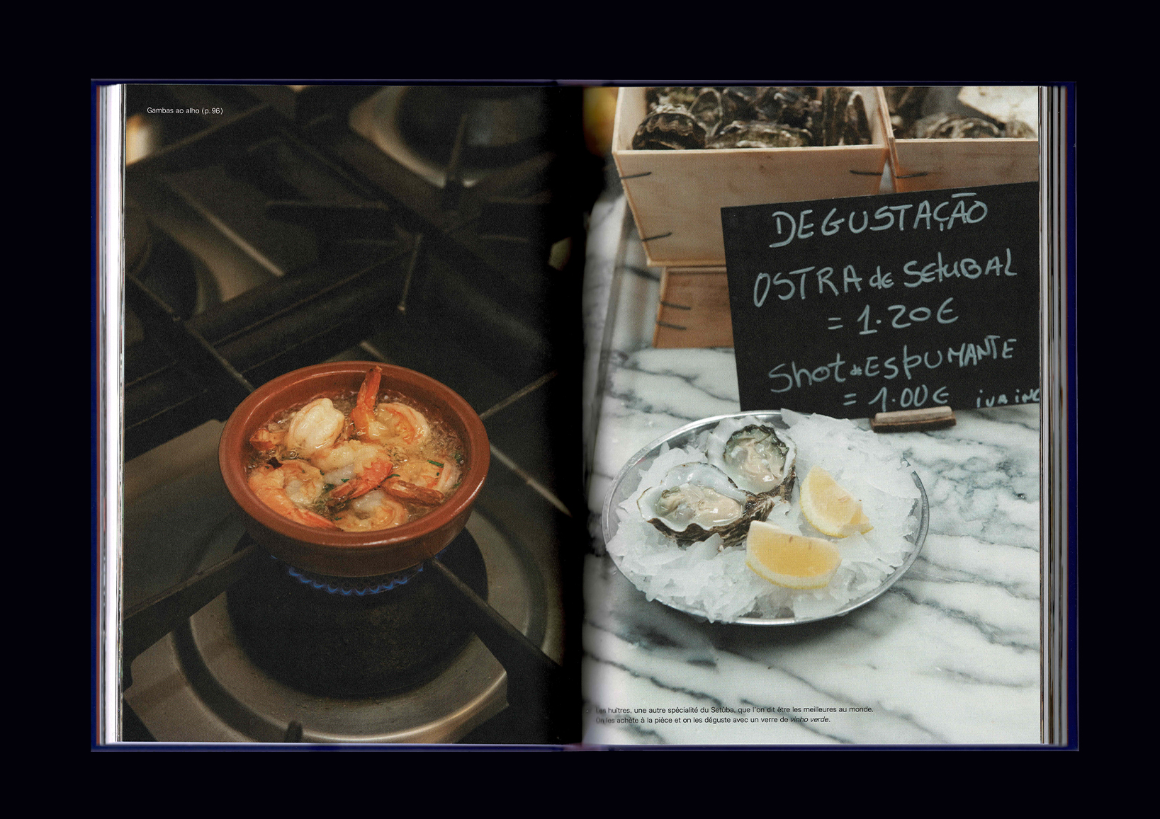
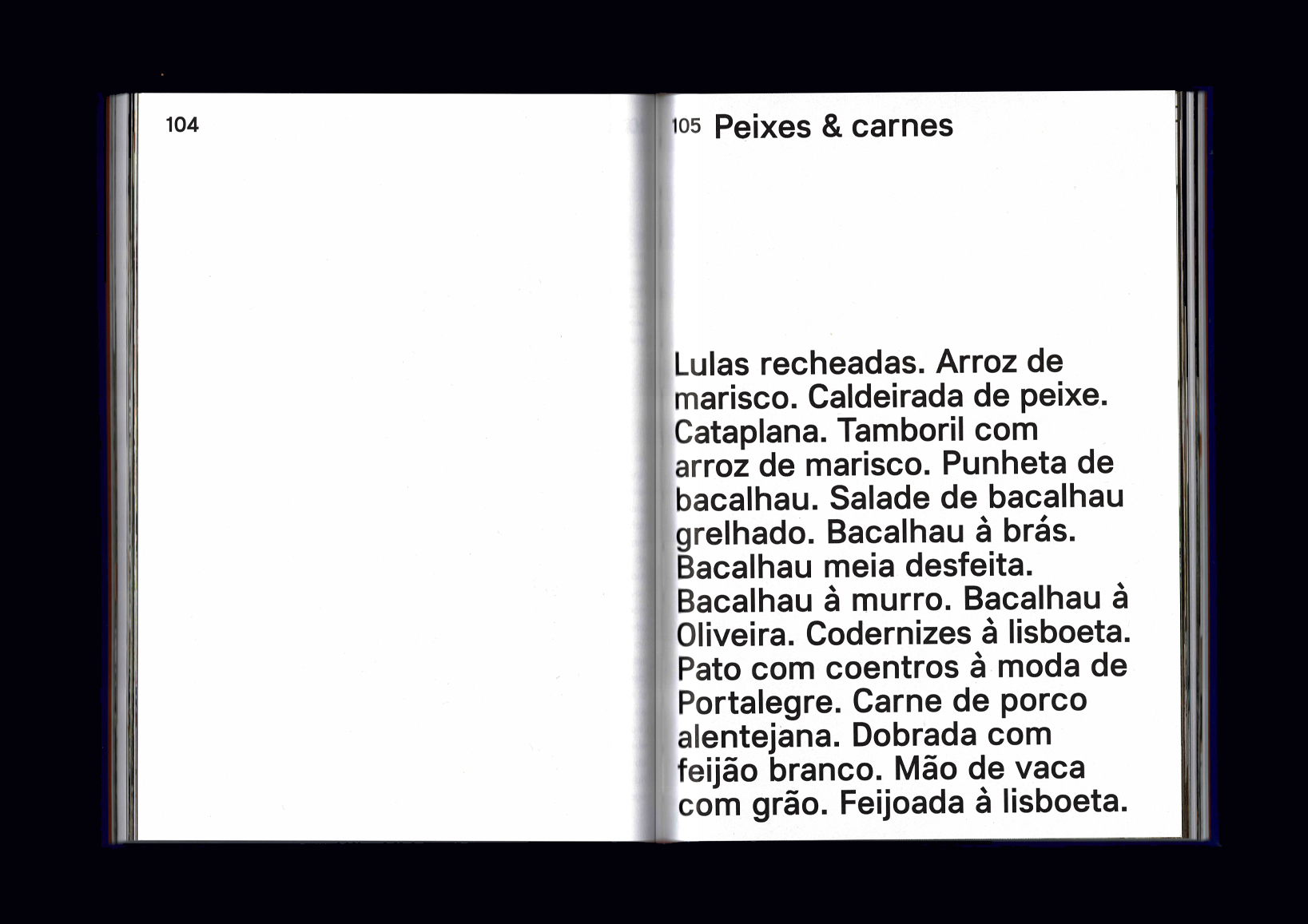
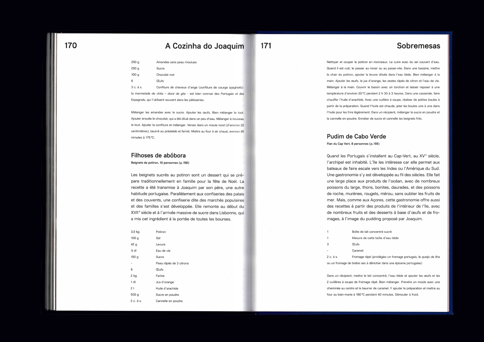
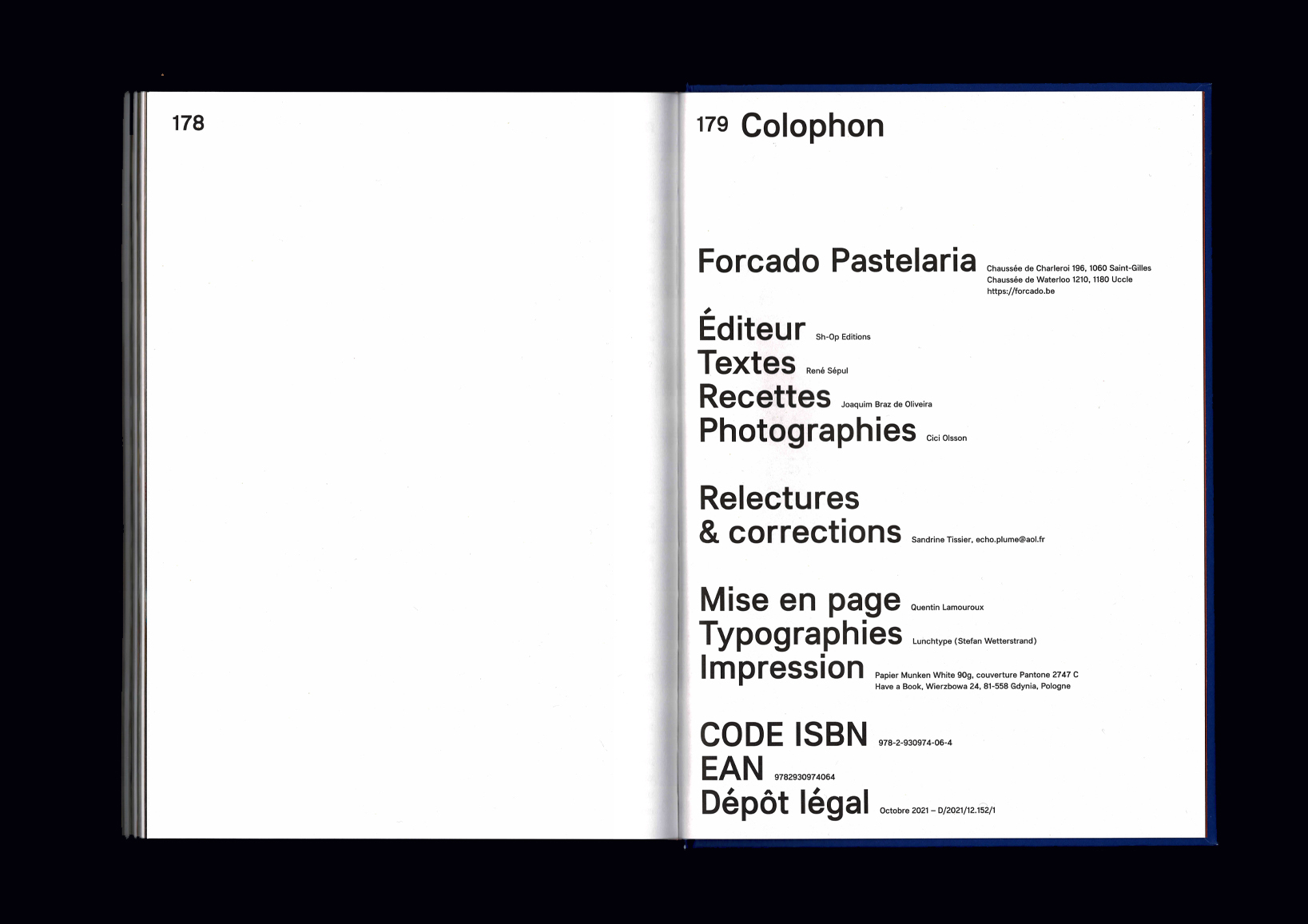
01 — Forcado, A Cozinha do Joaquim | Editorial |
|---|
2021 — Gratuated in Master Design and political of the multiple, Typography, Erg (École de Recherche Graphique), Brussels [be].
2019 — Graduated in Bachelor Typography, Erg (École de Recherche Graphique), Brussels [be].
2015 — Graduated in Communication School, Lille 3 University, Lille [fr].
Follow me on Instagram.